

TheAdress Yerevan
About
The Art of Urban Luxury
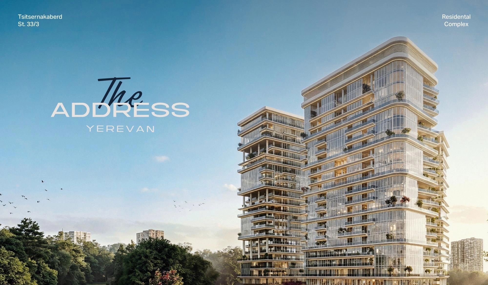
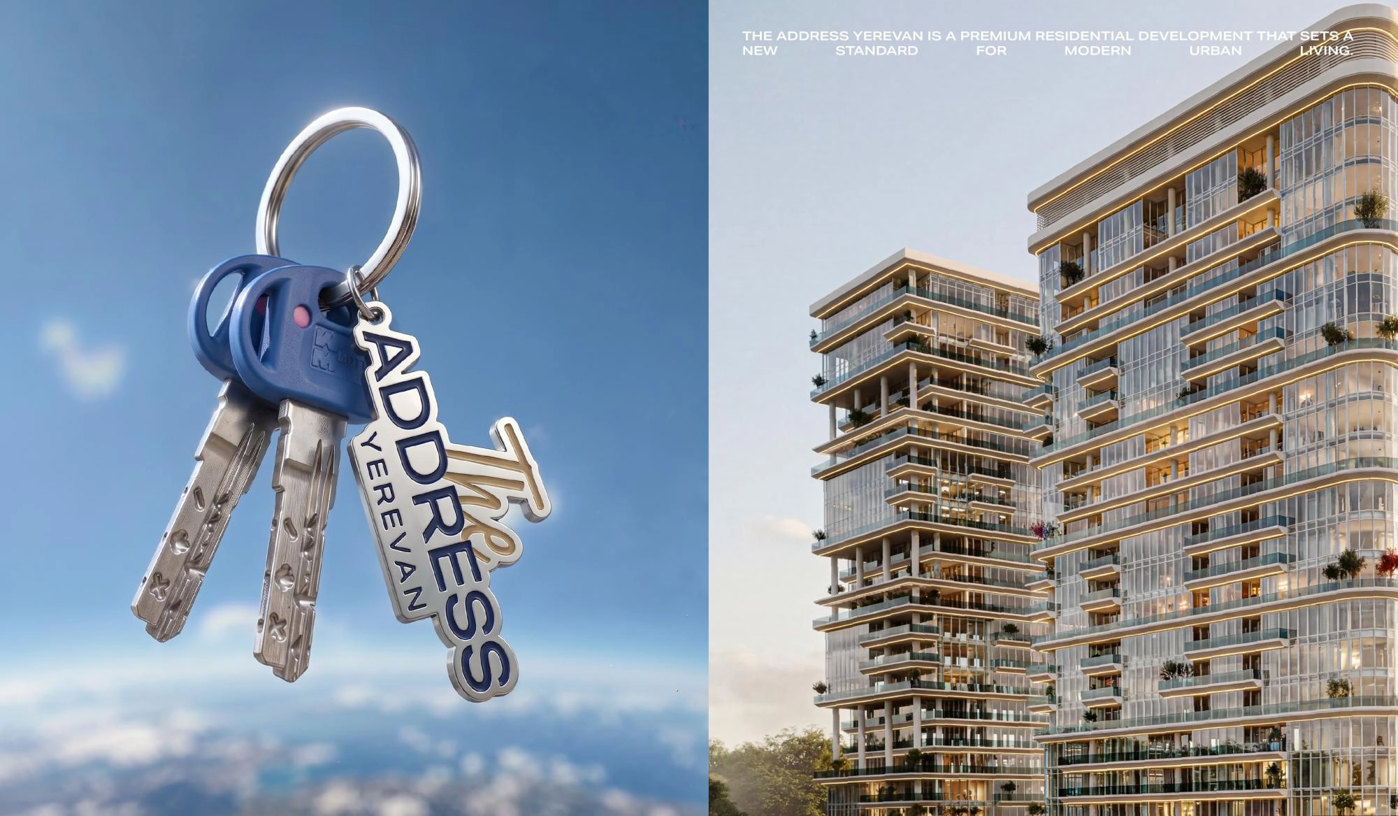
The concept behind "The Address Yerevan" is rooted in the idea of urban luxury, reflecting the project’s distinctive architecture and contemporary lifestyle.
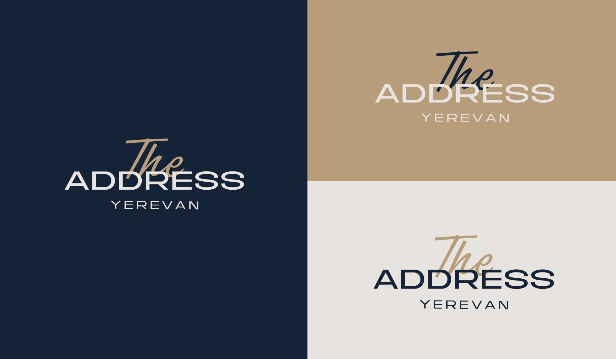
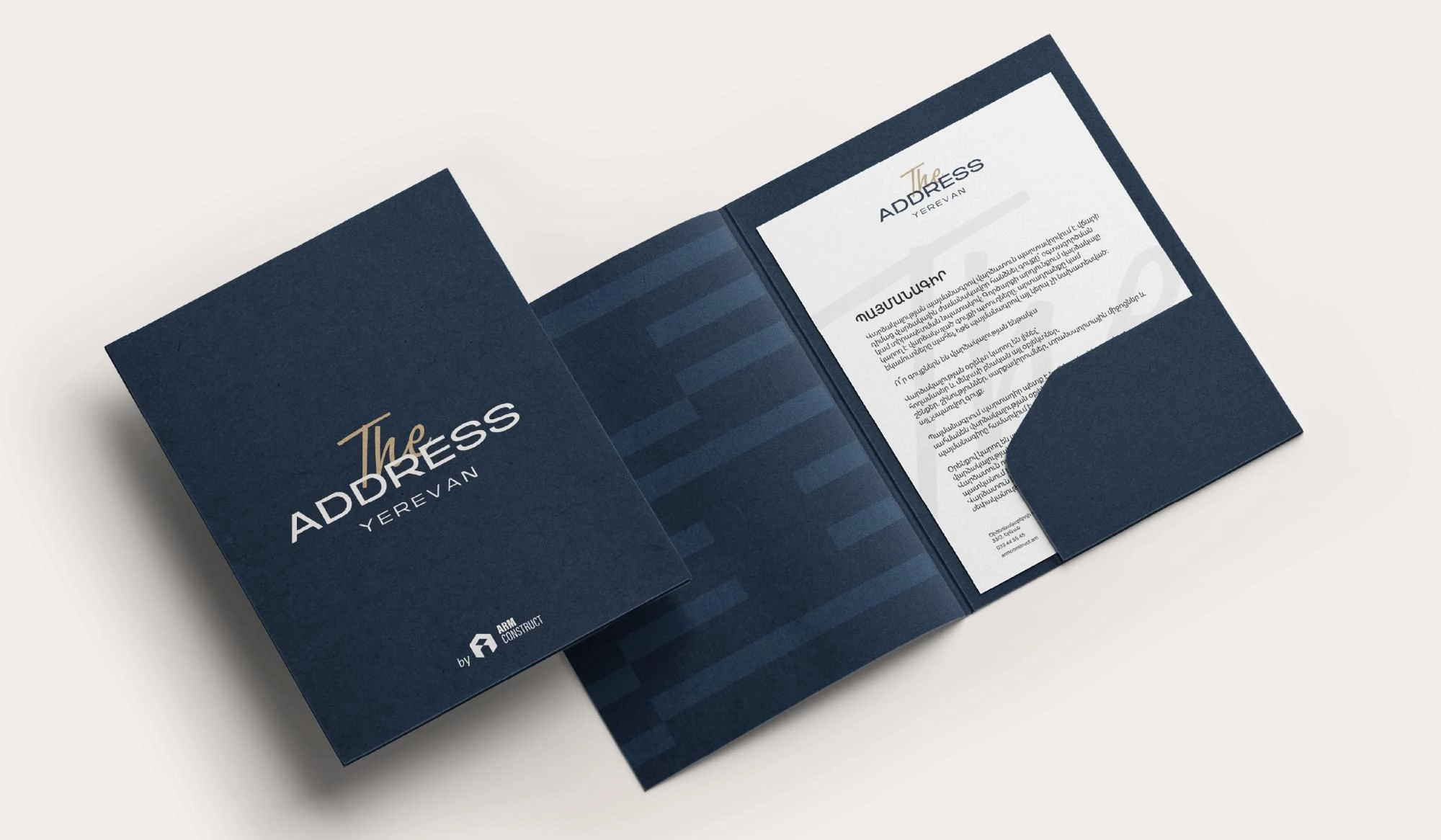
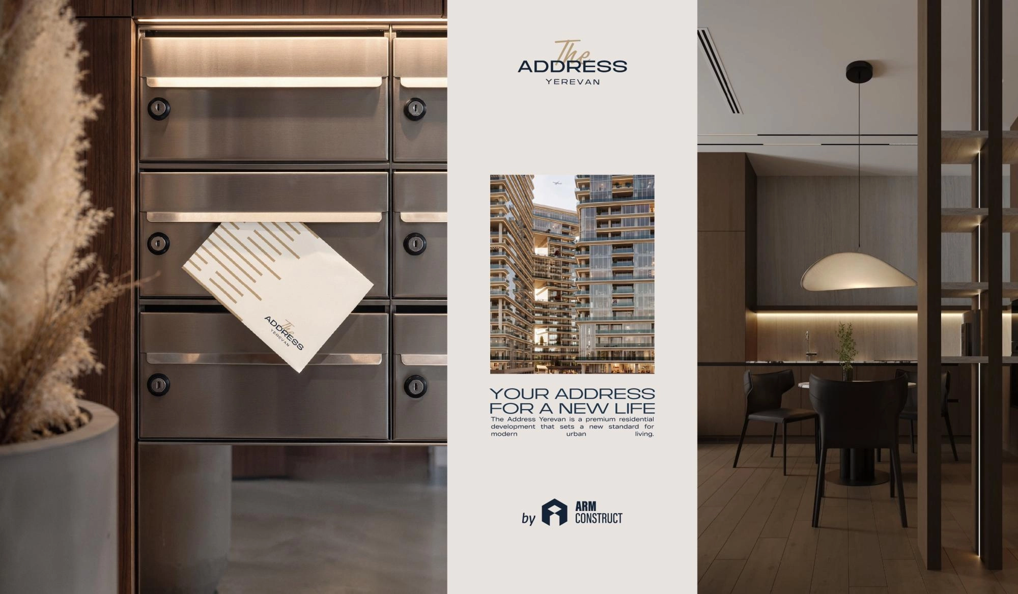
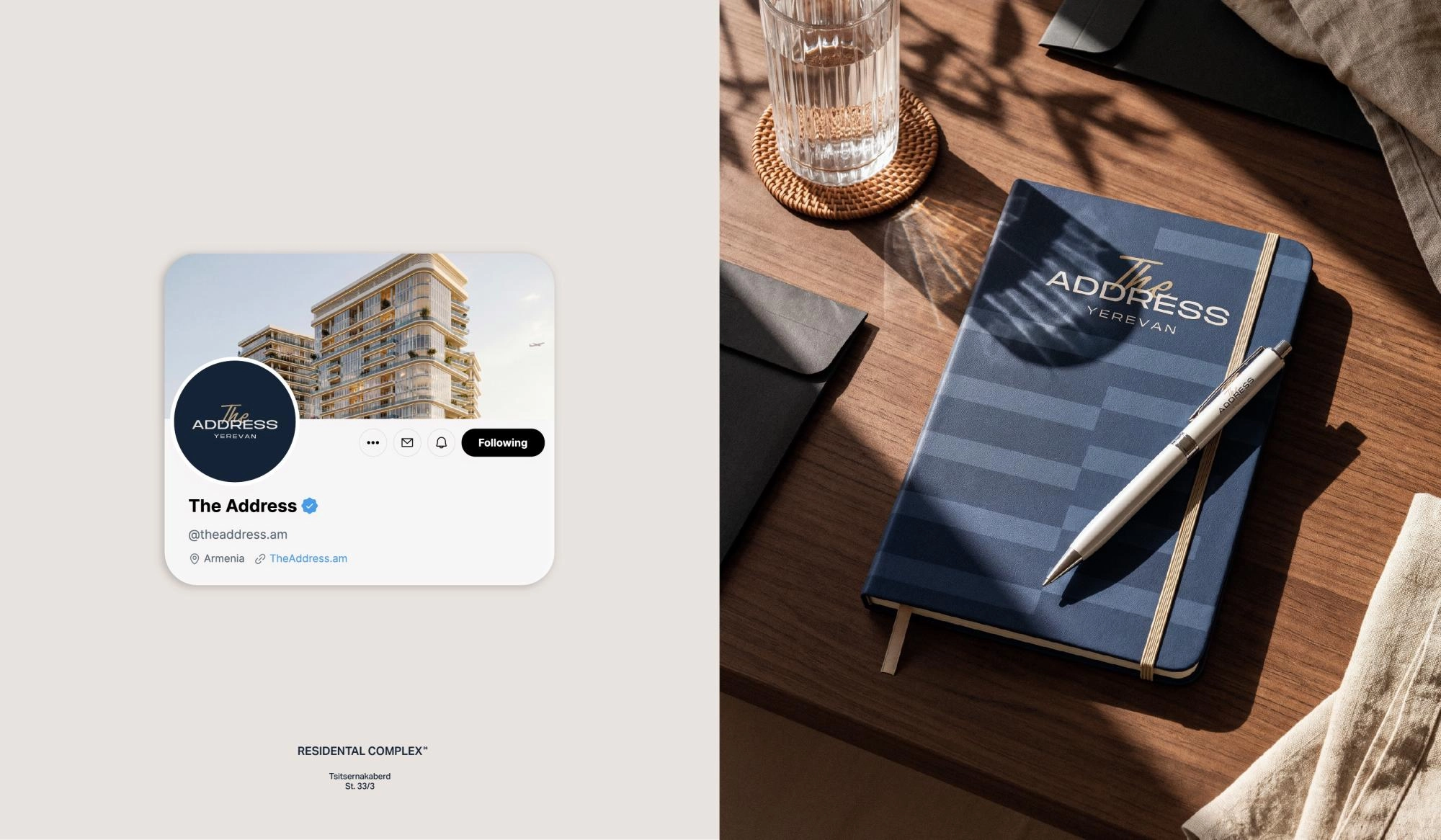
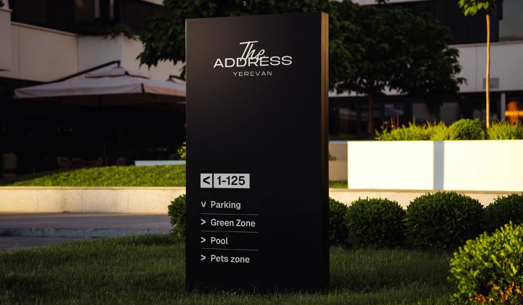
The logo combines clean, refined typography with a contrasting handwritten “The,” adding a personal touch, warmth and subtle elegance to the overall identity.
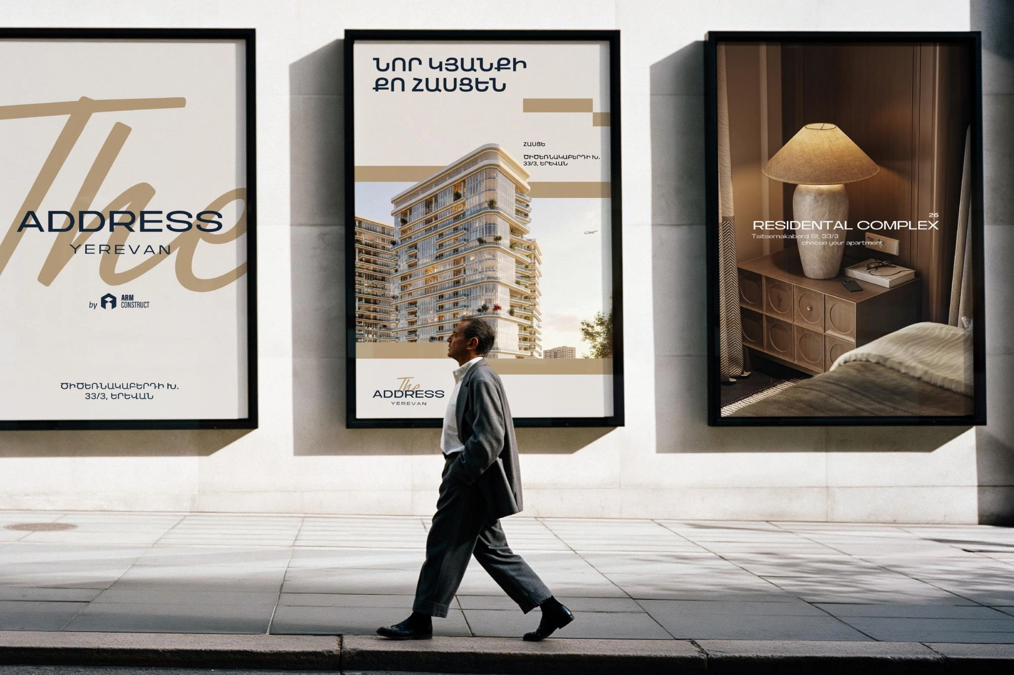
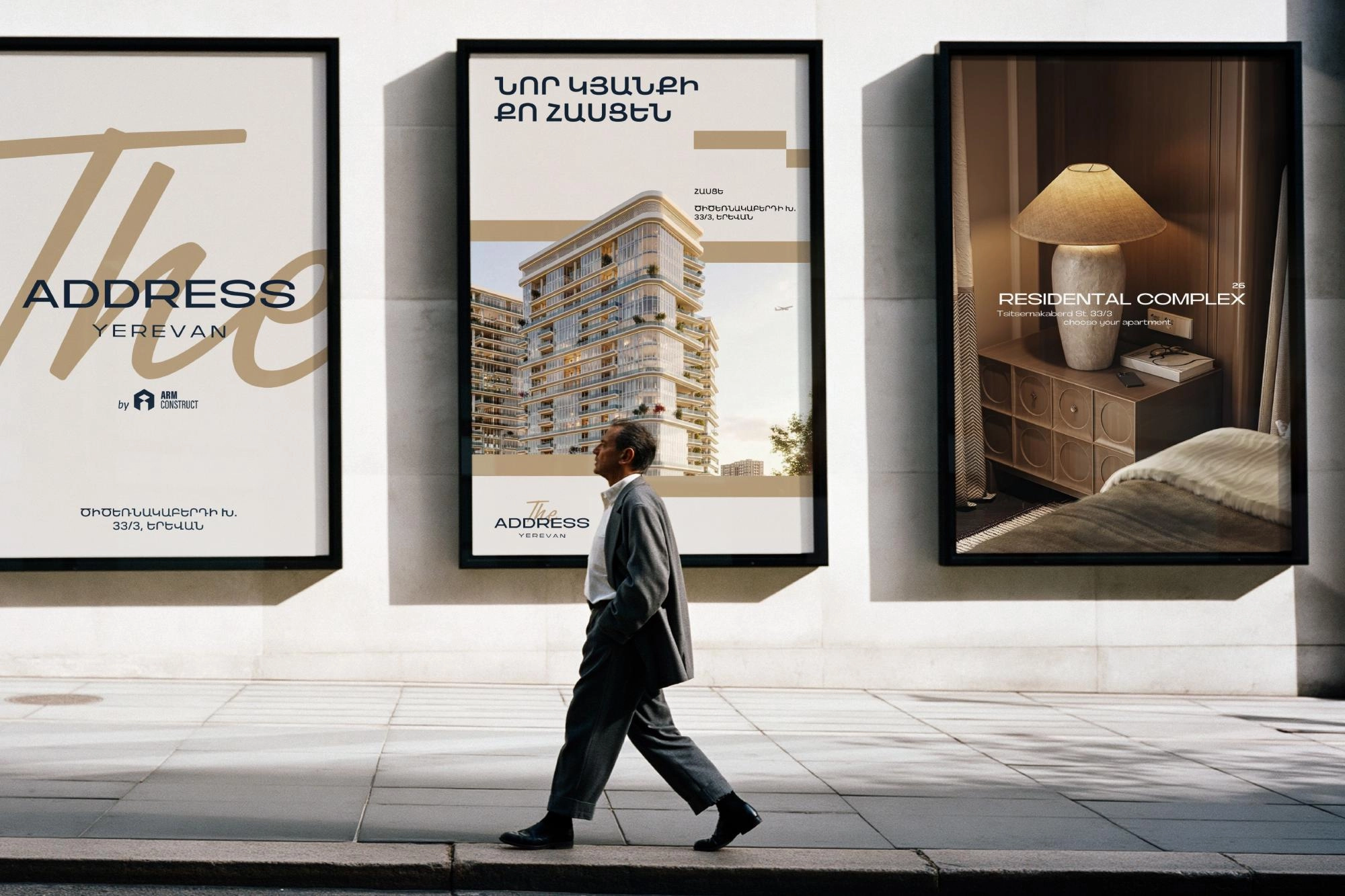
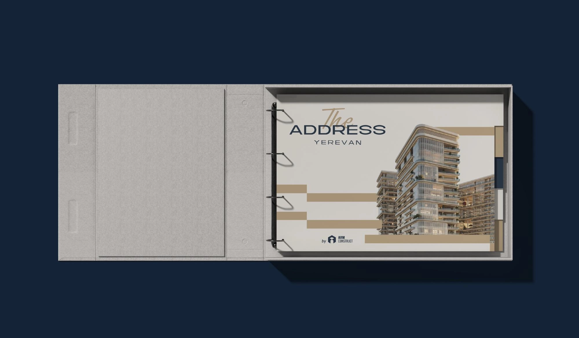
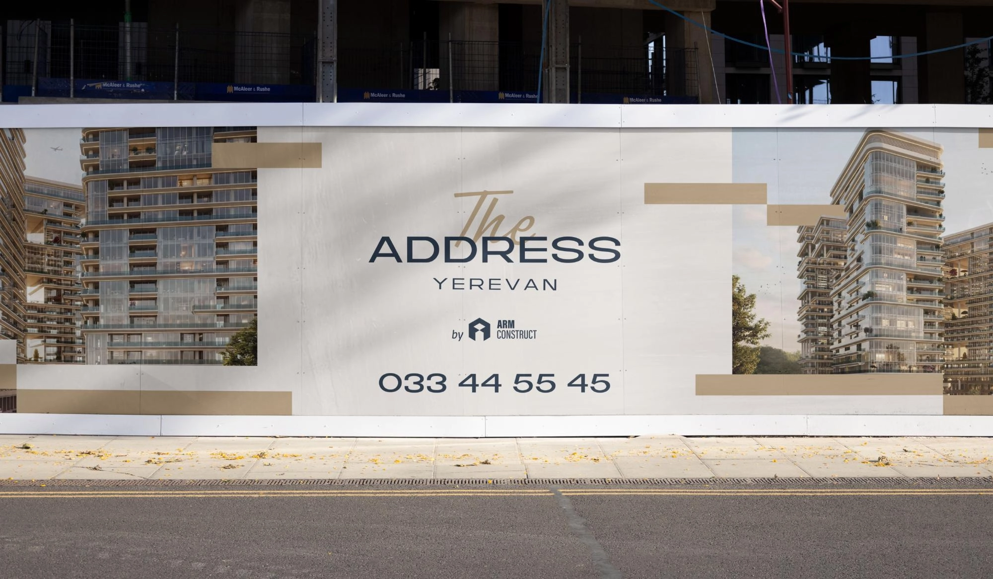
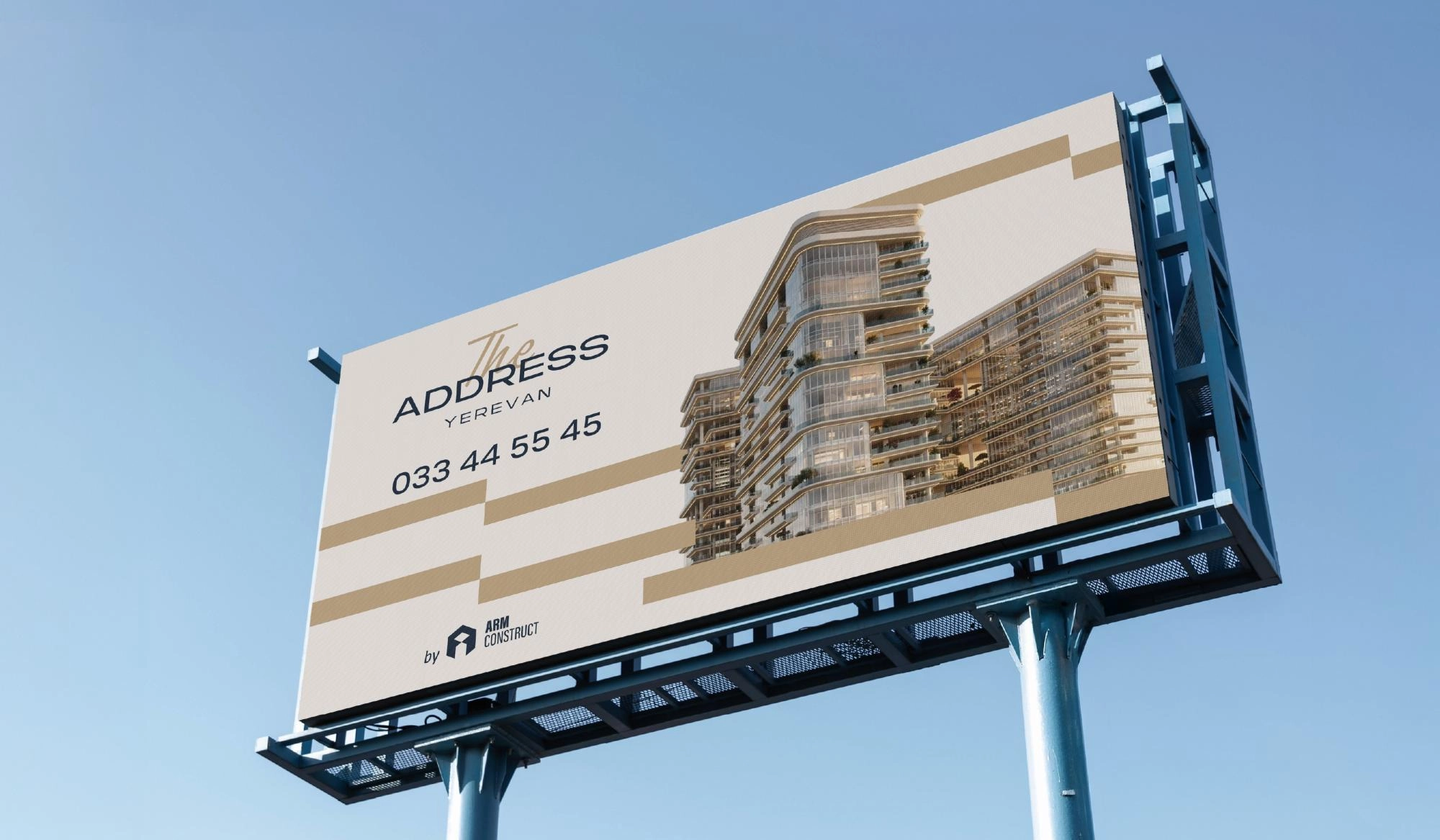
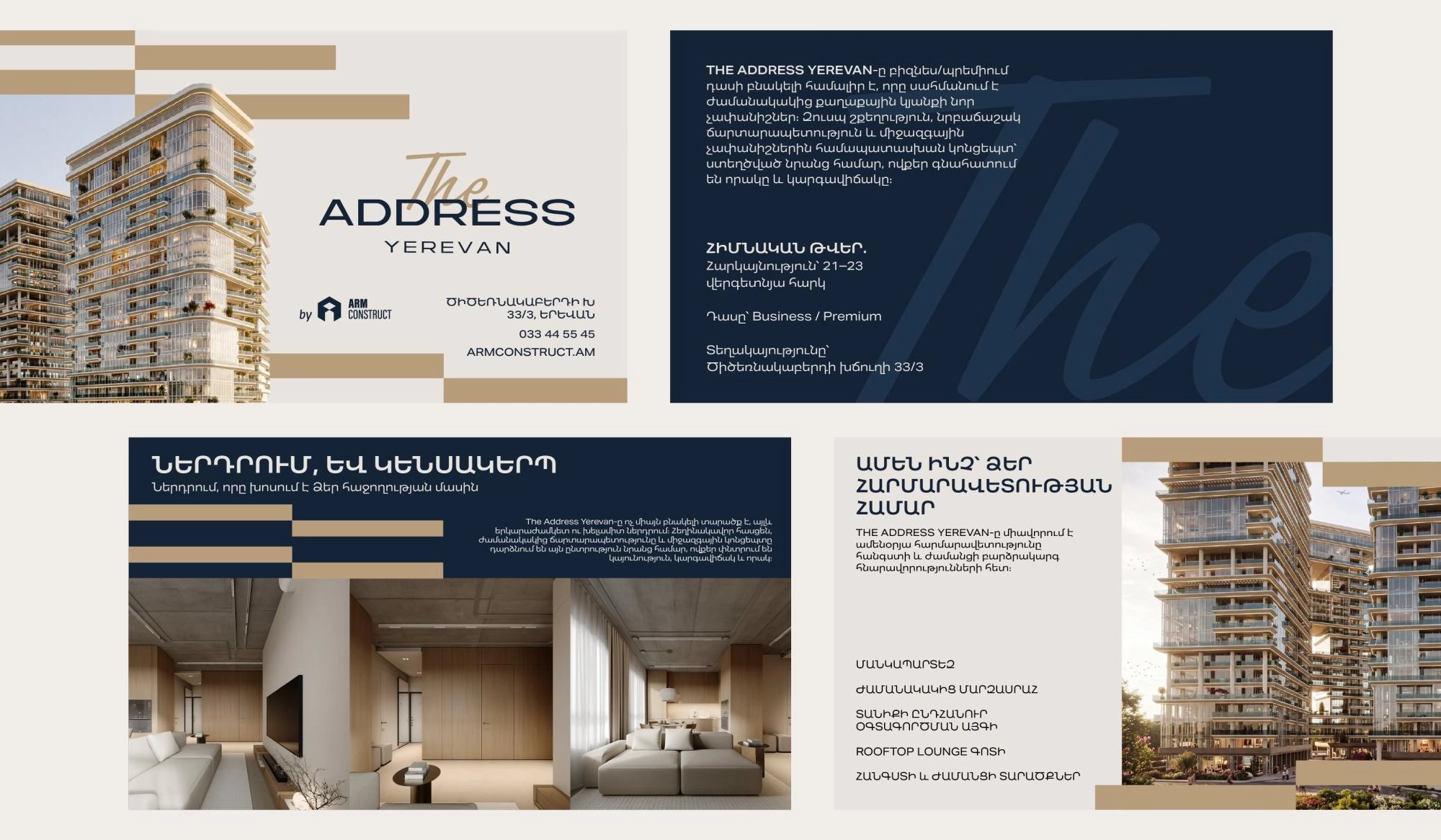
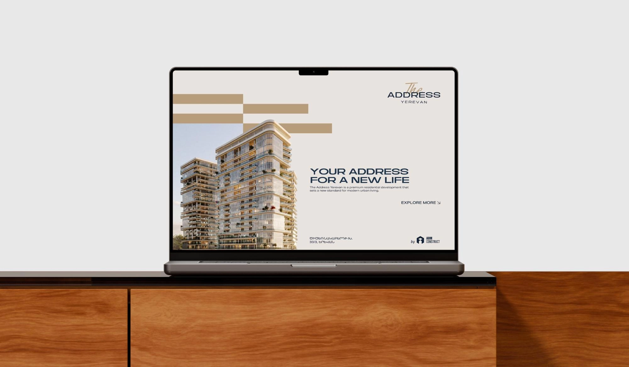
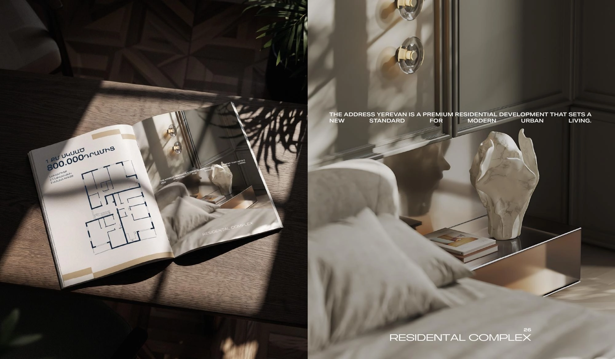
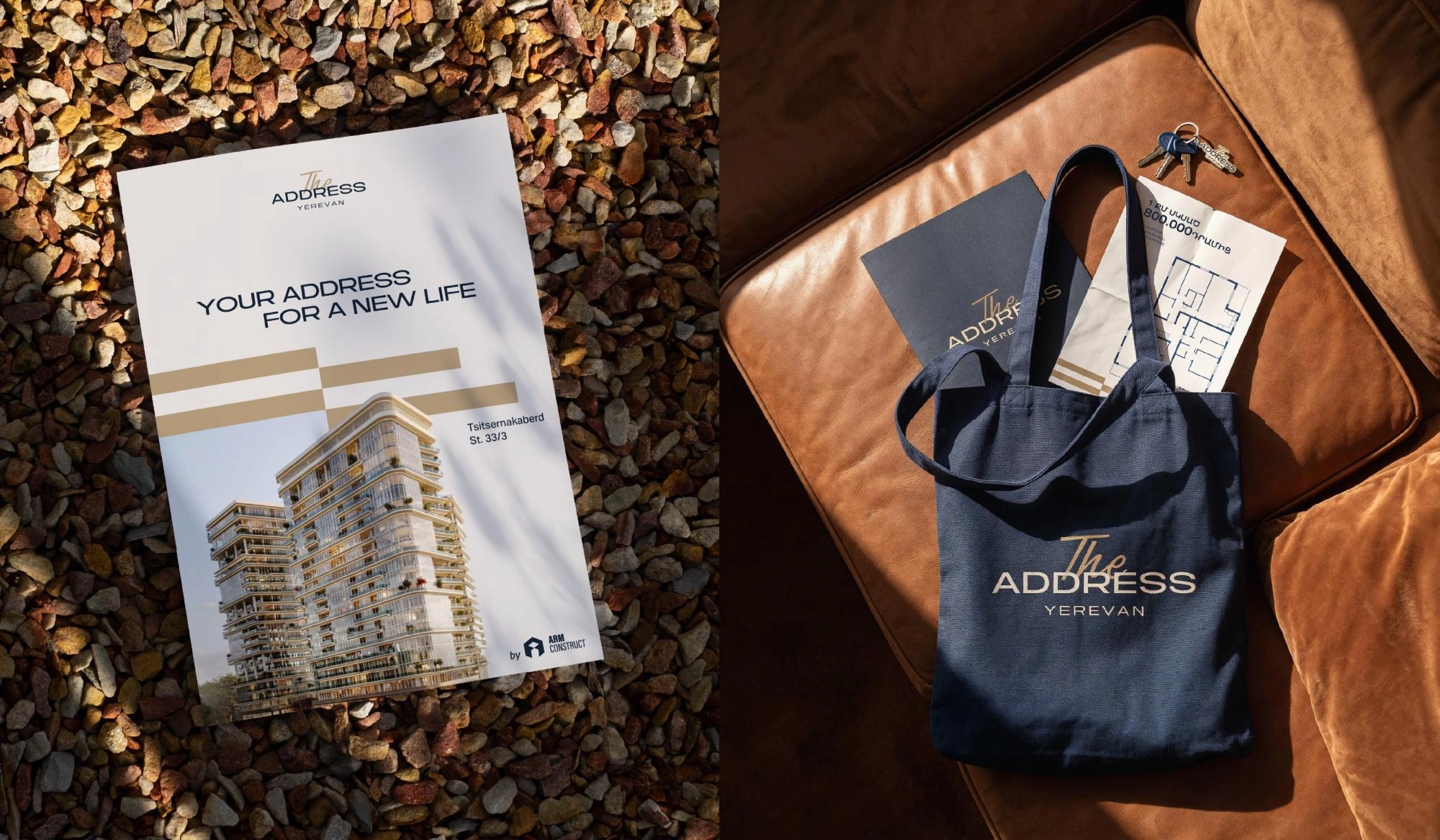
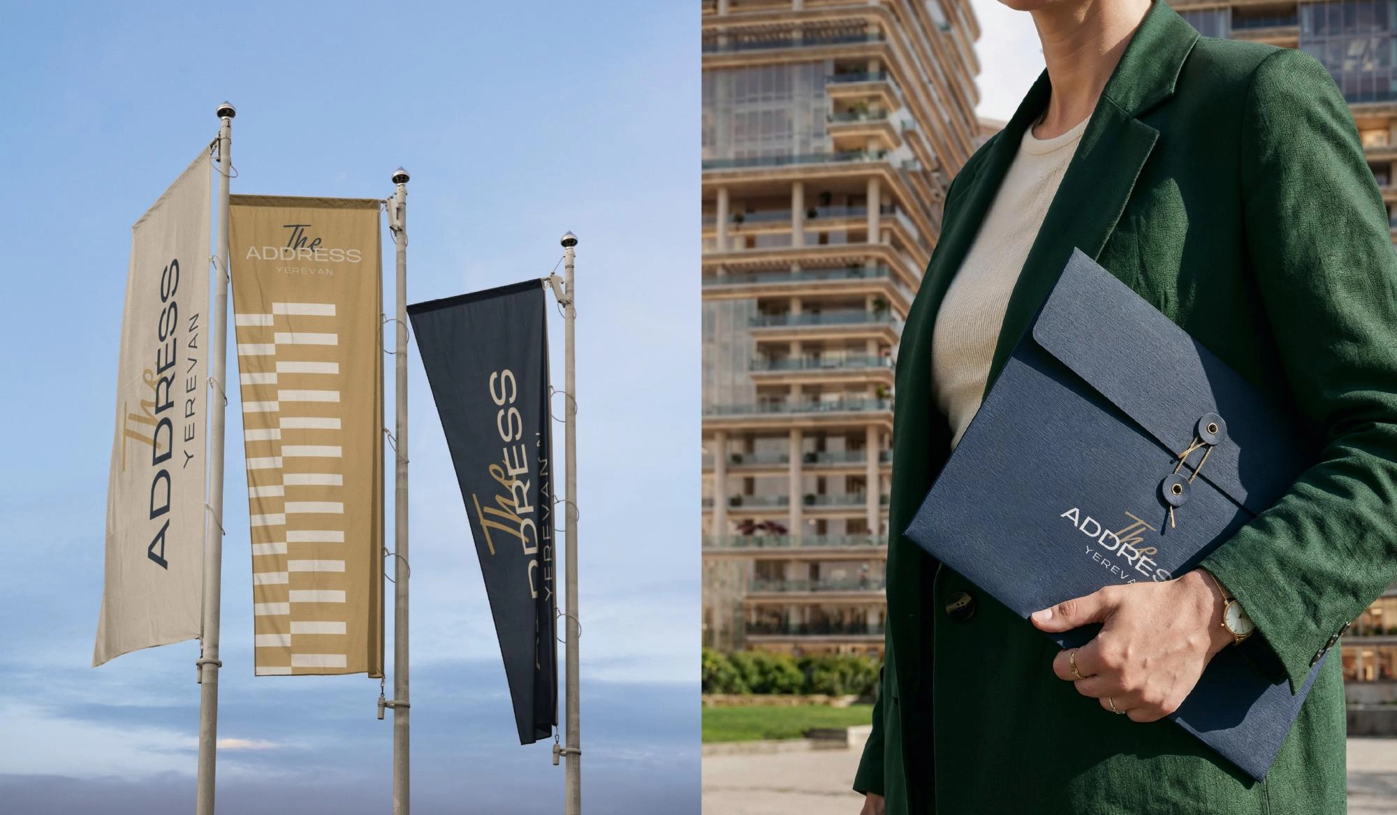
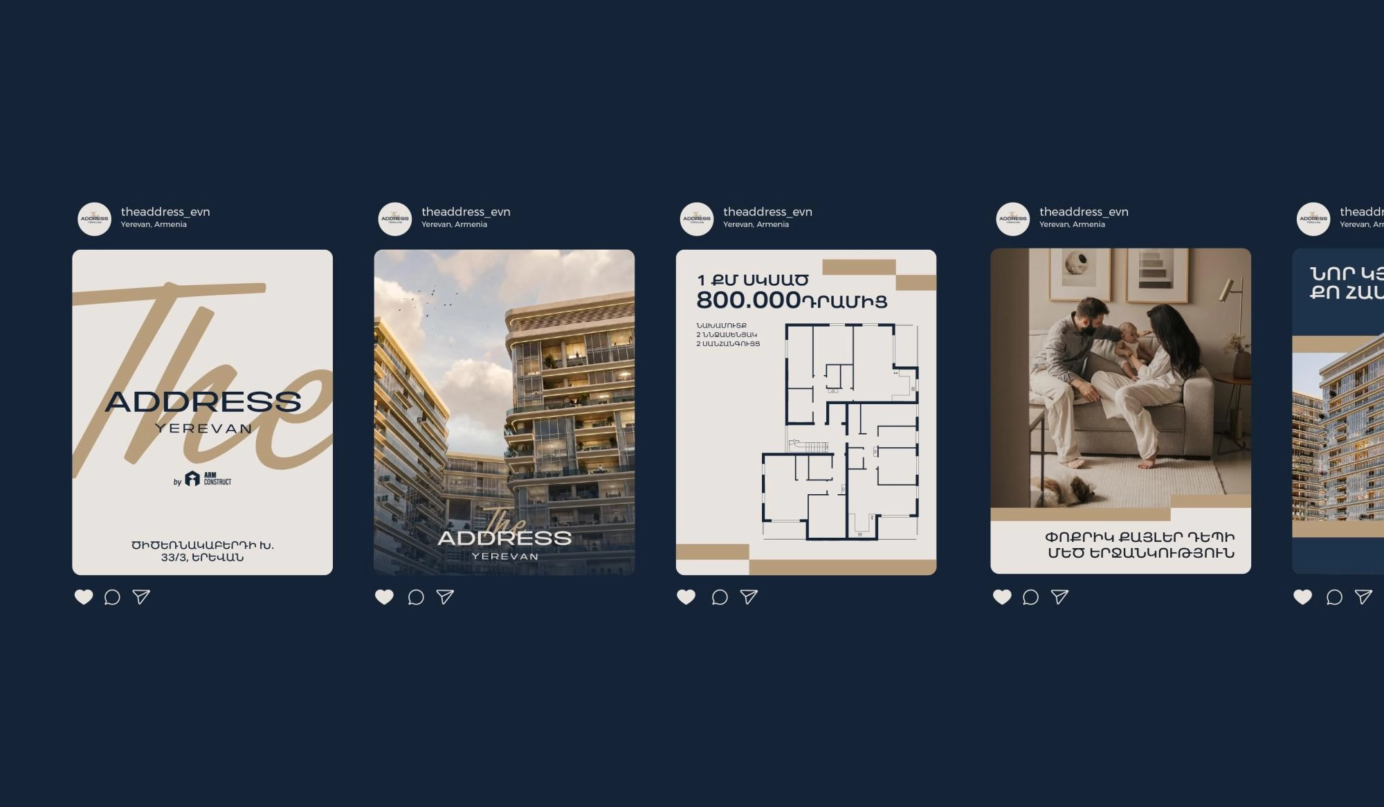
The brand’s graphic elements draw directly from the building’s architecture. Horizontal lines of varying lengths, inspired by the facade, have been transformed into a flexible visual system that adapts seamlessly across different applications while maintaining a consistent and recognizable brand identity.
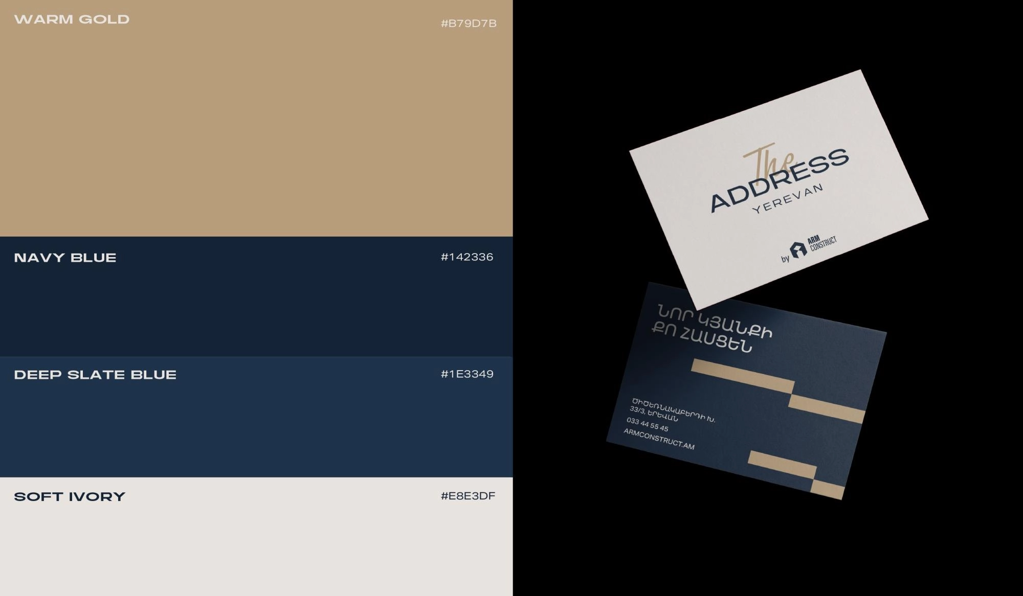
The color palette brings together deep navy blue, warm beige and soft neutral tones, capturing the architectural character and warmth of the project while creating an atmosphere of understated luxury and contemporary sophistication.
The logo combines clean, refined typography with a contrasting handwritten “The,” adding a personal touch, warmth and subtle elegance to the overall identity.
The brand’s graphic elements draw directly from the building’s architecture. Horizontal lines of varying lengths, inspired by the facade, have been transformed into a flexible visual system that adapts seamlessly across different applications while maintaining a consistent and recognizable brand identity.
The color palette brings together deep navy blue, warm beige and soft neutral tones, capturing the architectural character and warmth of the project while creating an atmosphere of understated luxury and contemporary sophistication.
Team Involved
Karen Babajanyan / Founder & Branding Director
Anya Andranikyan / Art Director
Tatevik Harutyunyan / Project Manager
Movses Khudaverdyan / Graphic Designer
Luiza Nersisyan / Portfolio Designer
More works
All works
Yerevanyan
Restaurant

Inogate
Advanced Engineering