
Inogate
About
Where Structure Meets Simplicity
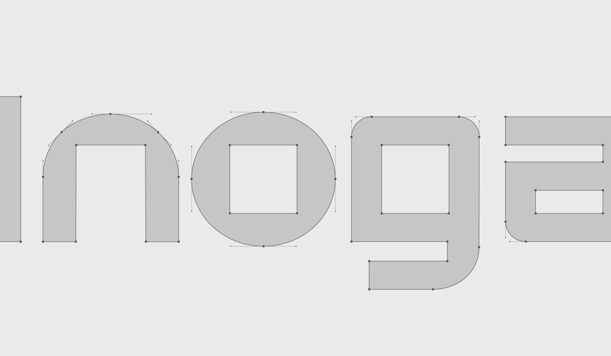
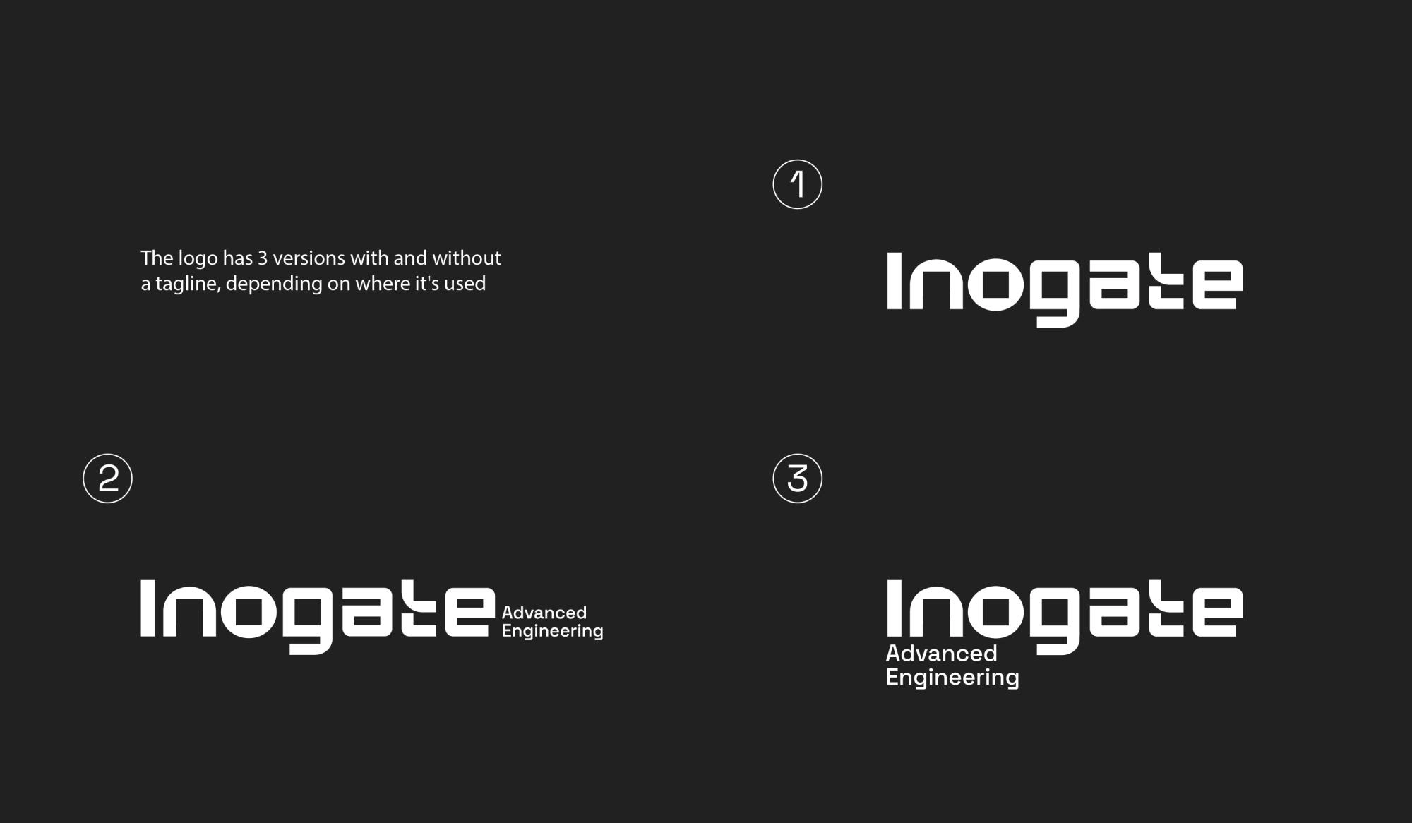
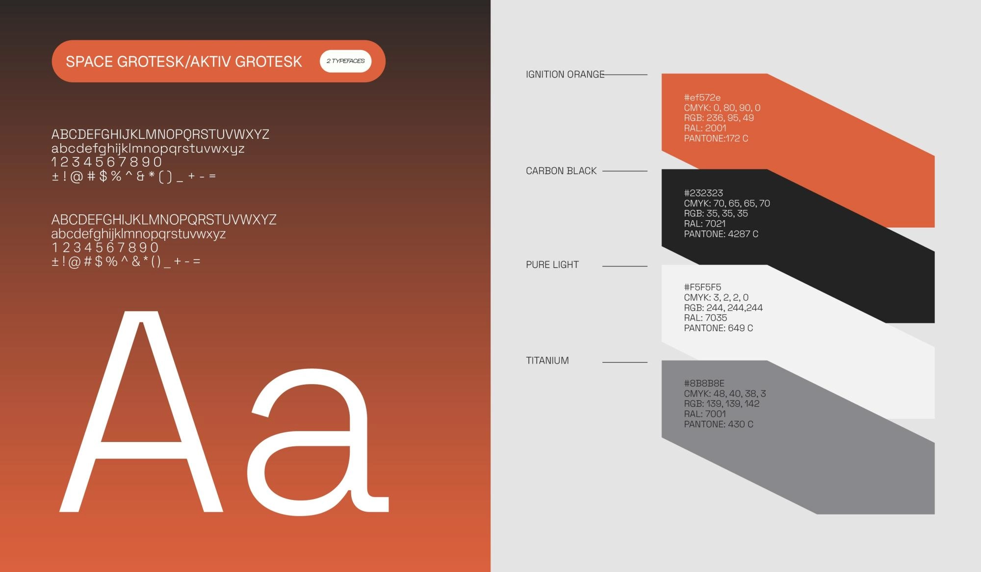
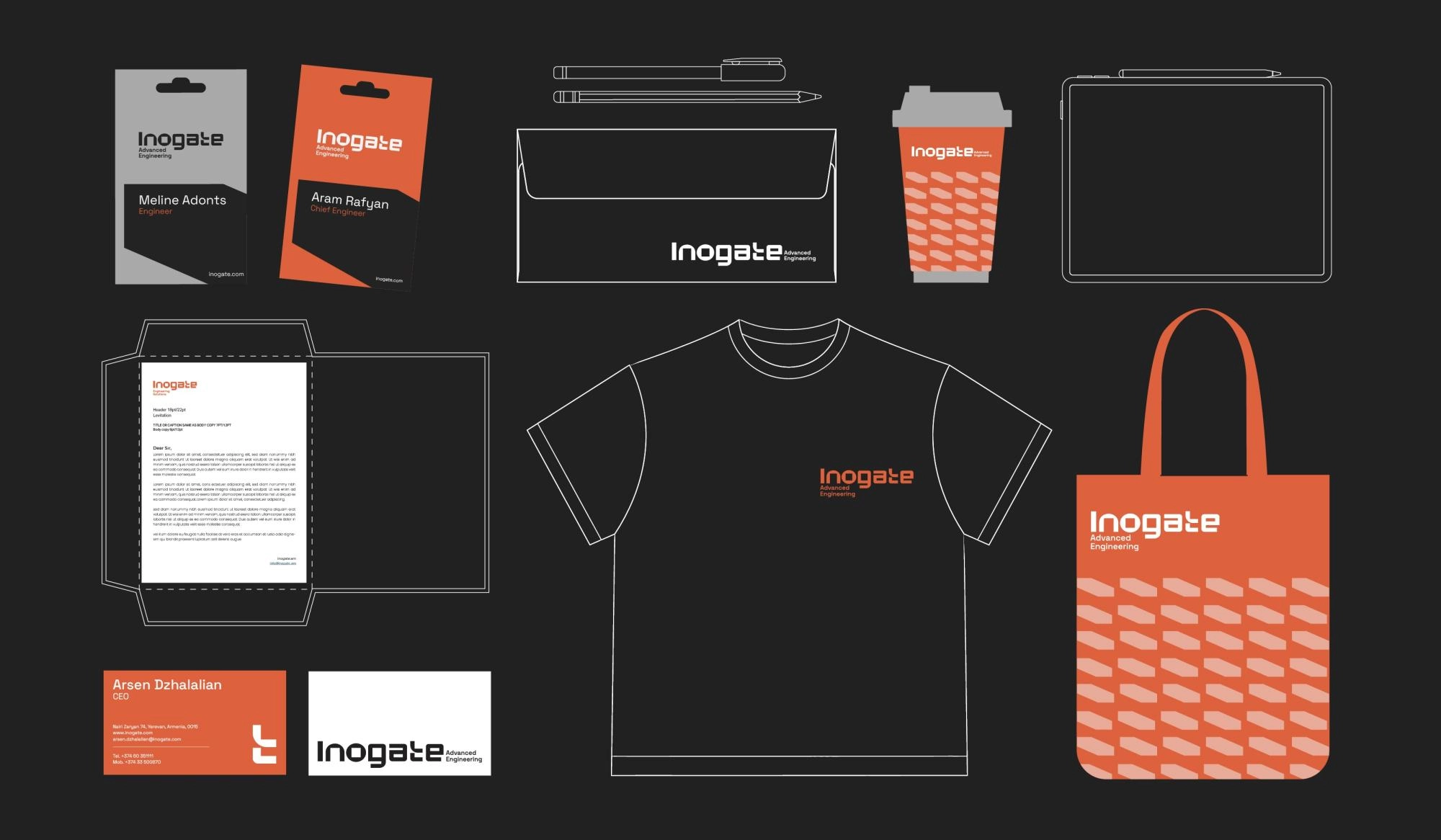
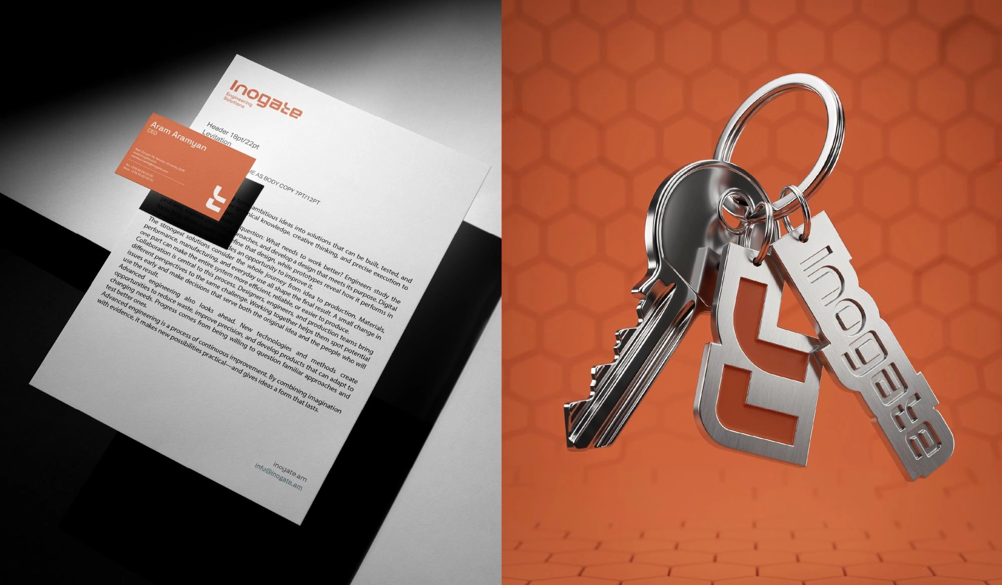
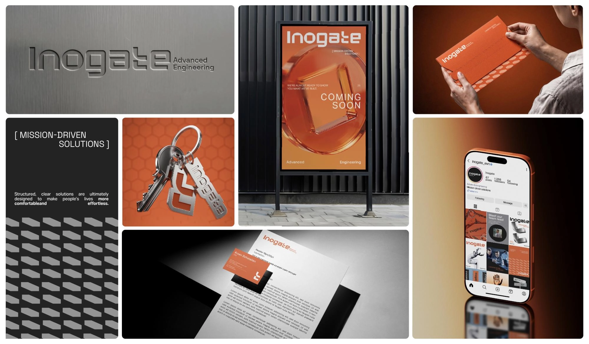
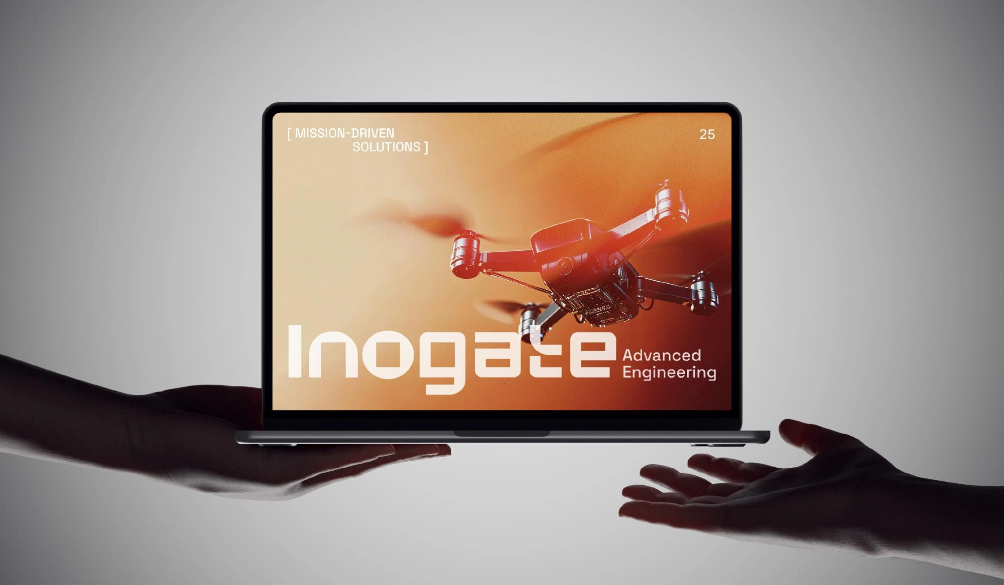
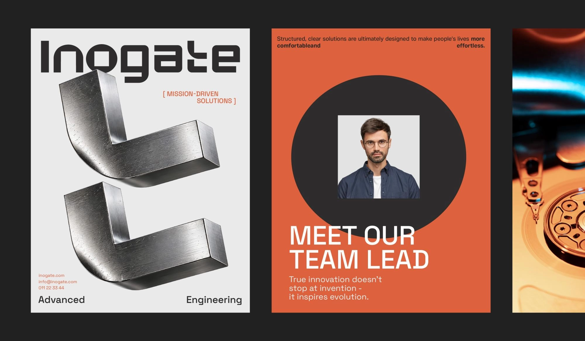
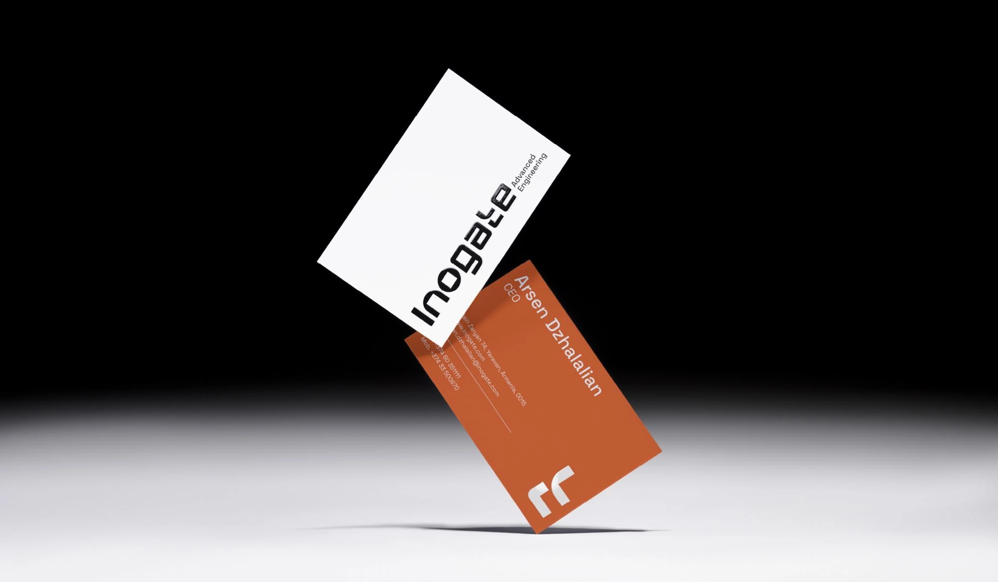
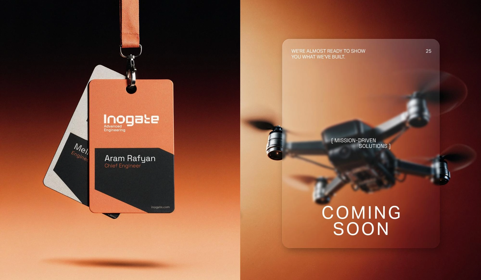
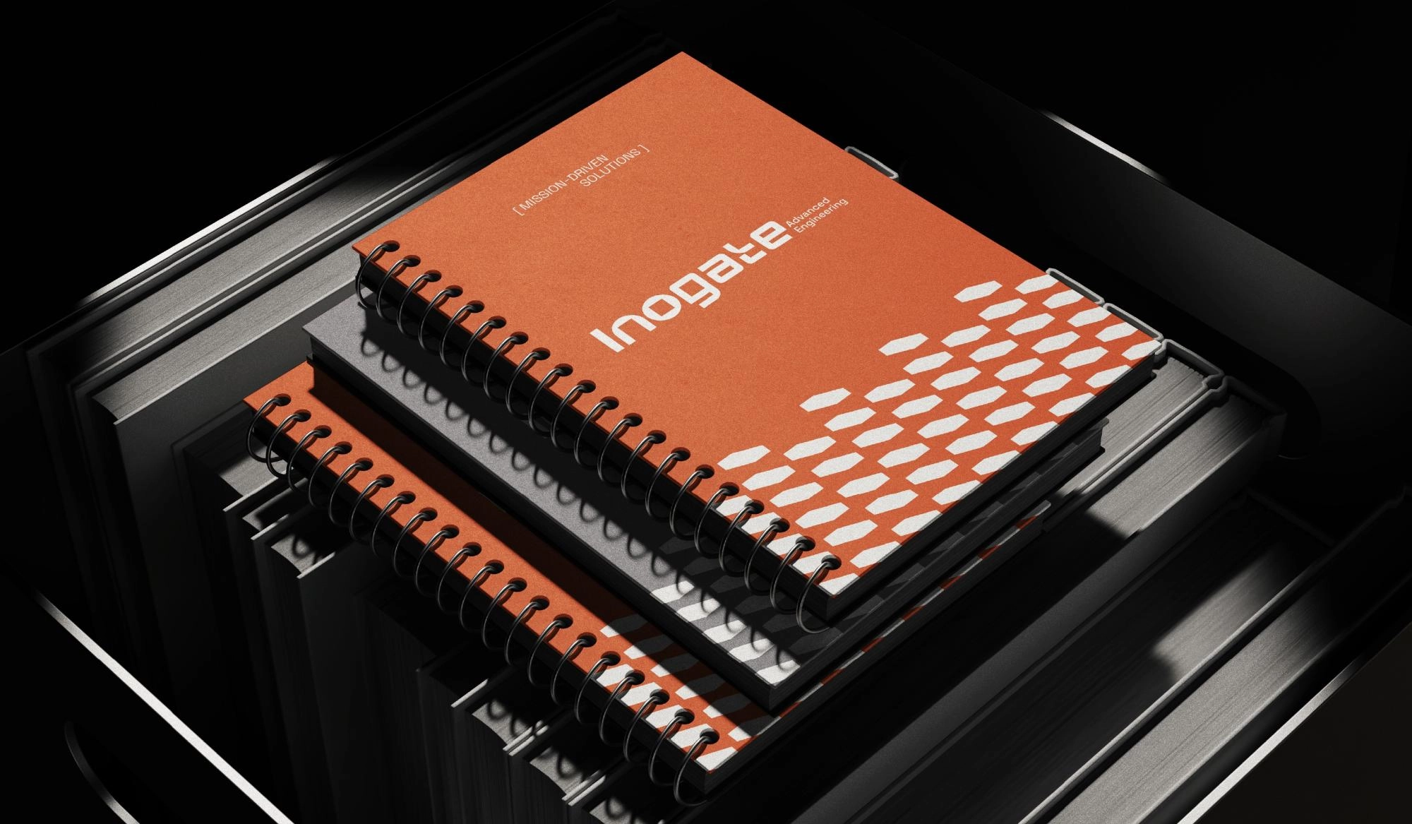
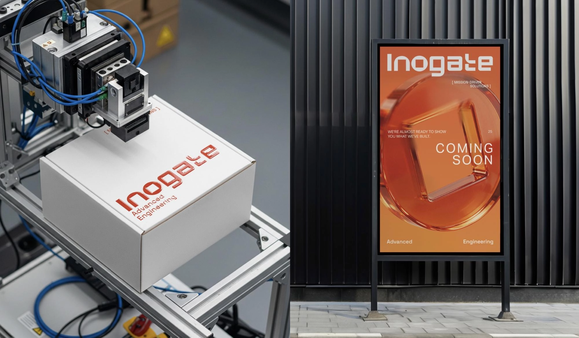
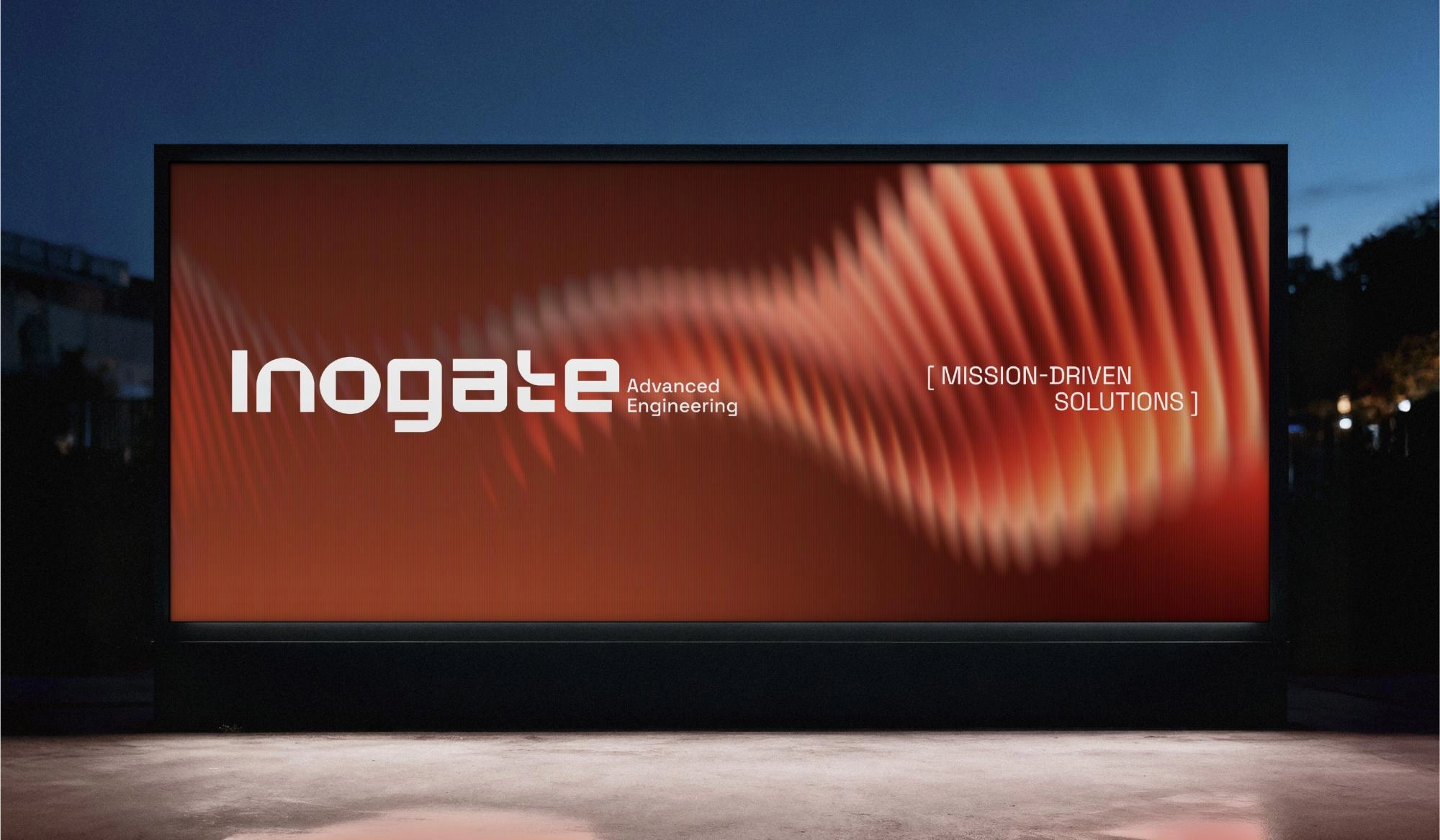
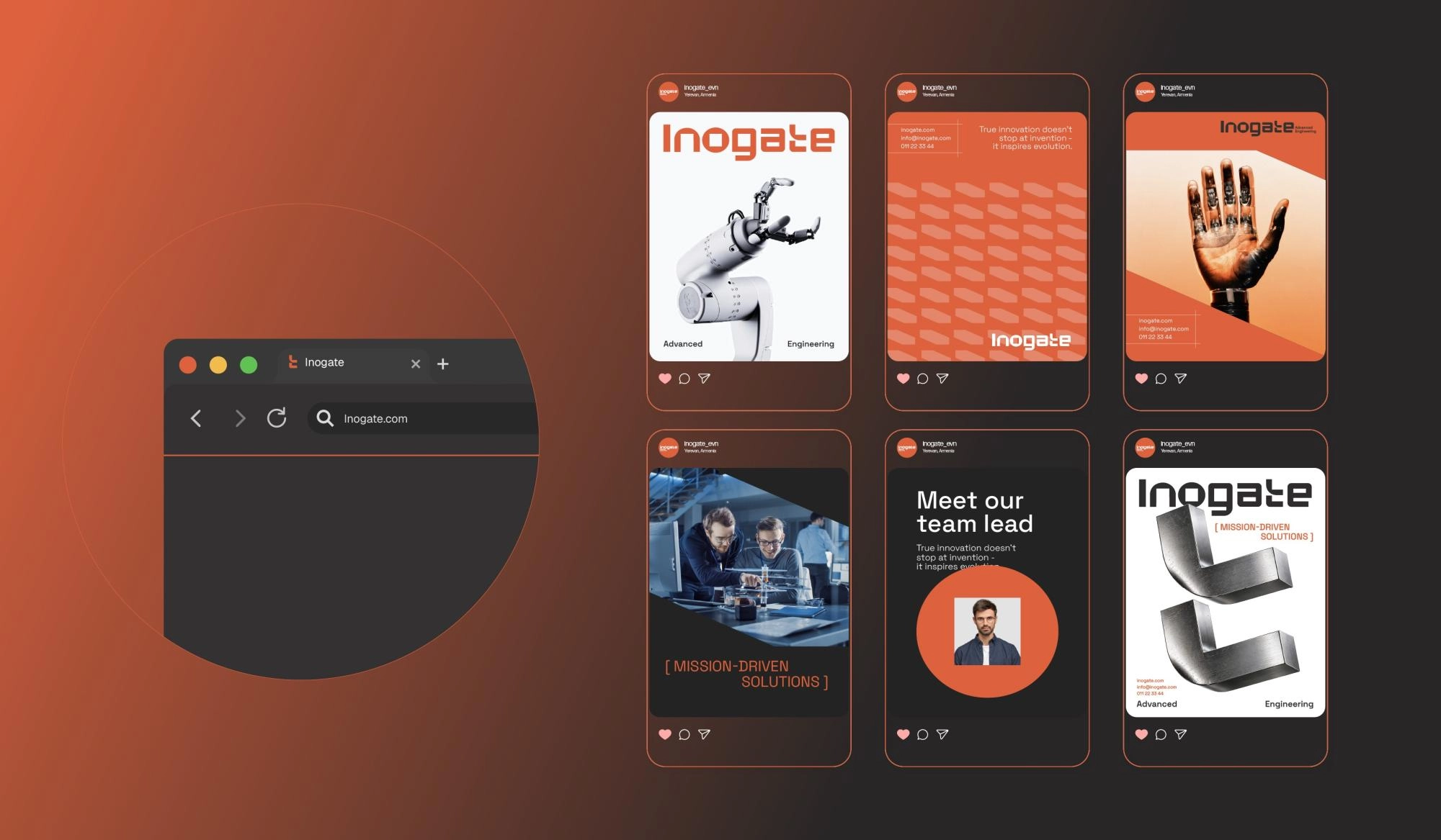
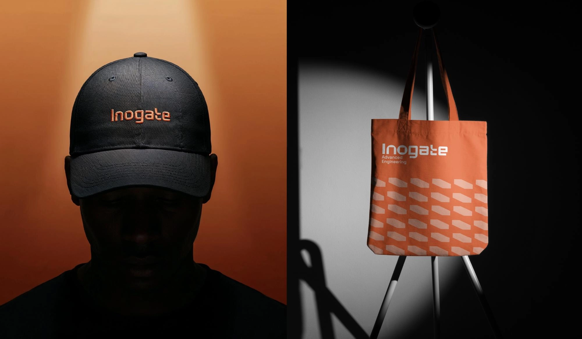
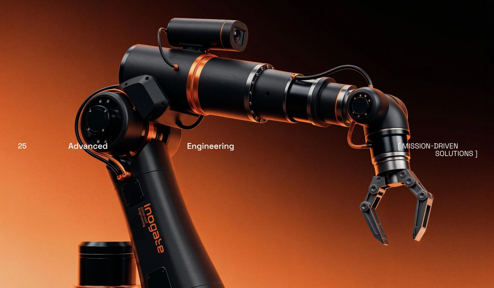
Structured, clear solutions are ultimately designed to make people's lives more comfortable and effortless. Inspired by this idea, we developed Inogate's new trademark and branding through a combination of sharp and soft angles. Orange, as a color of energy and initiative, represents progress and innovative thinking, while dark gray balances it by conveying trust, professionalism and stability. The brand's visual identity brings people and technology together, creating a flexible yet solid system where engineering solutions address real needs and support continuous progress.
Team Involved
Karen Babajanyan / Founder & Branding Director
Anya Andranikyan / Art Director / Graphic Designer
Tatevik Harutyunyan / Project Manager
Luiza Nersisyan / Brandbook & Portfolio Designer