

About
The visual language of the optx
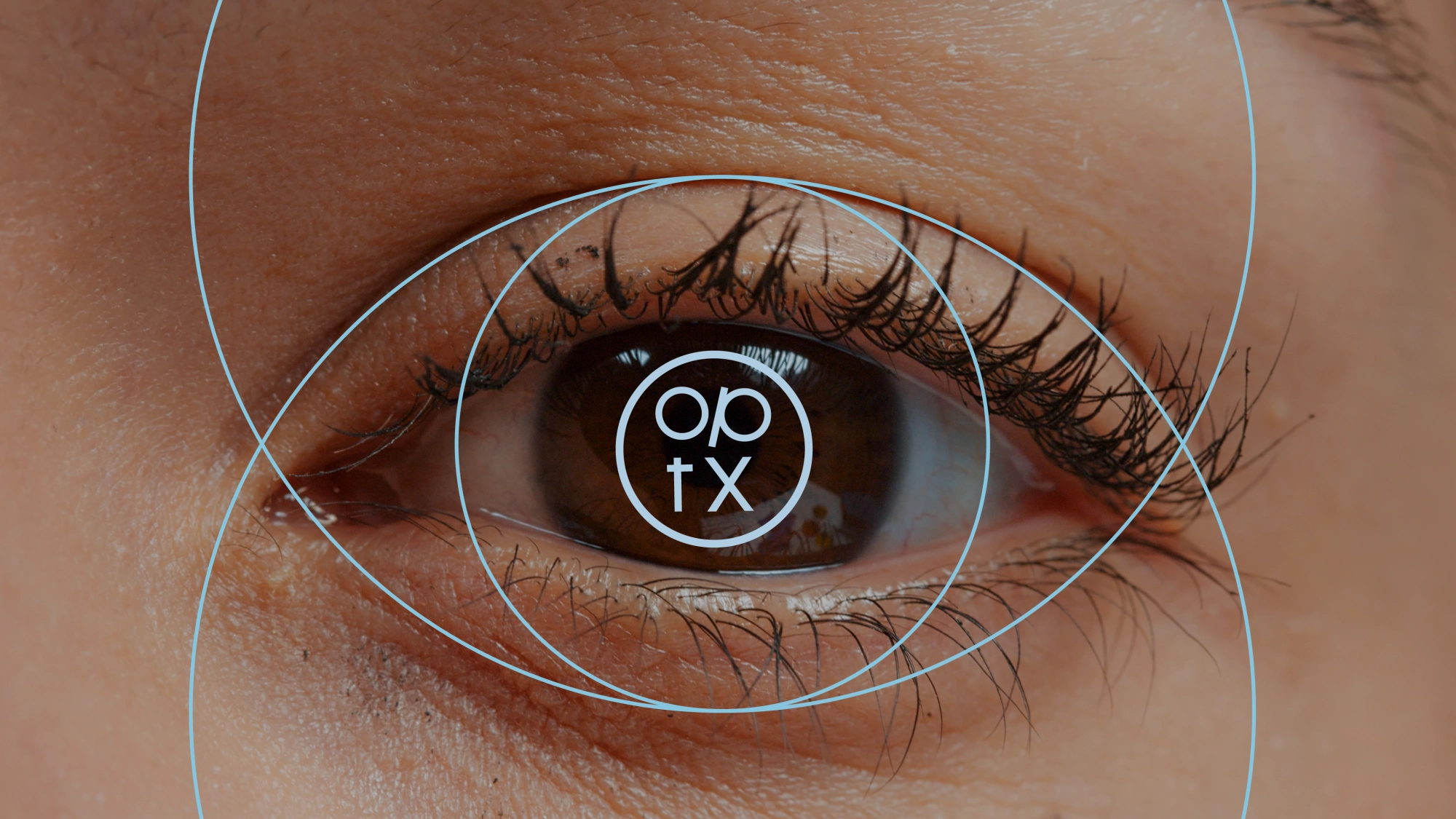
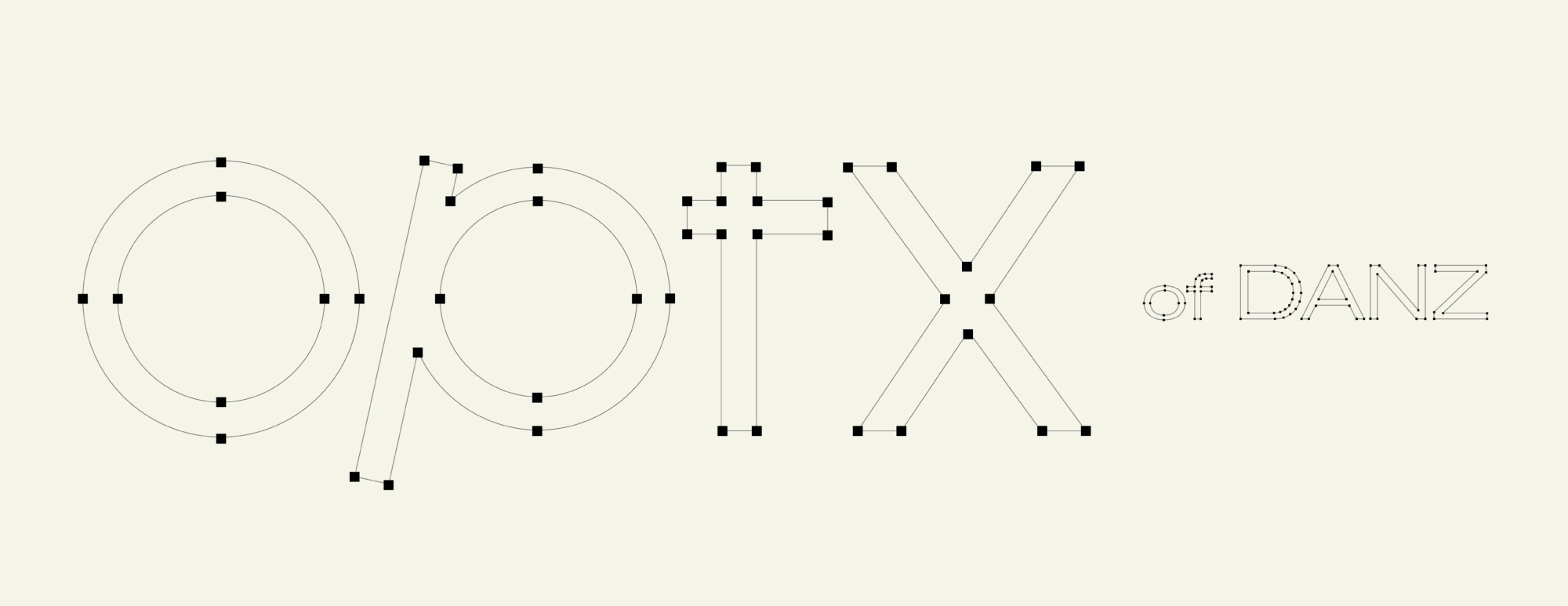
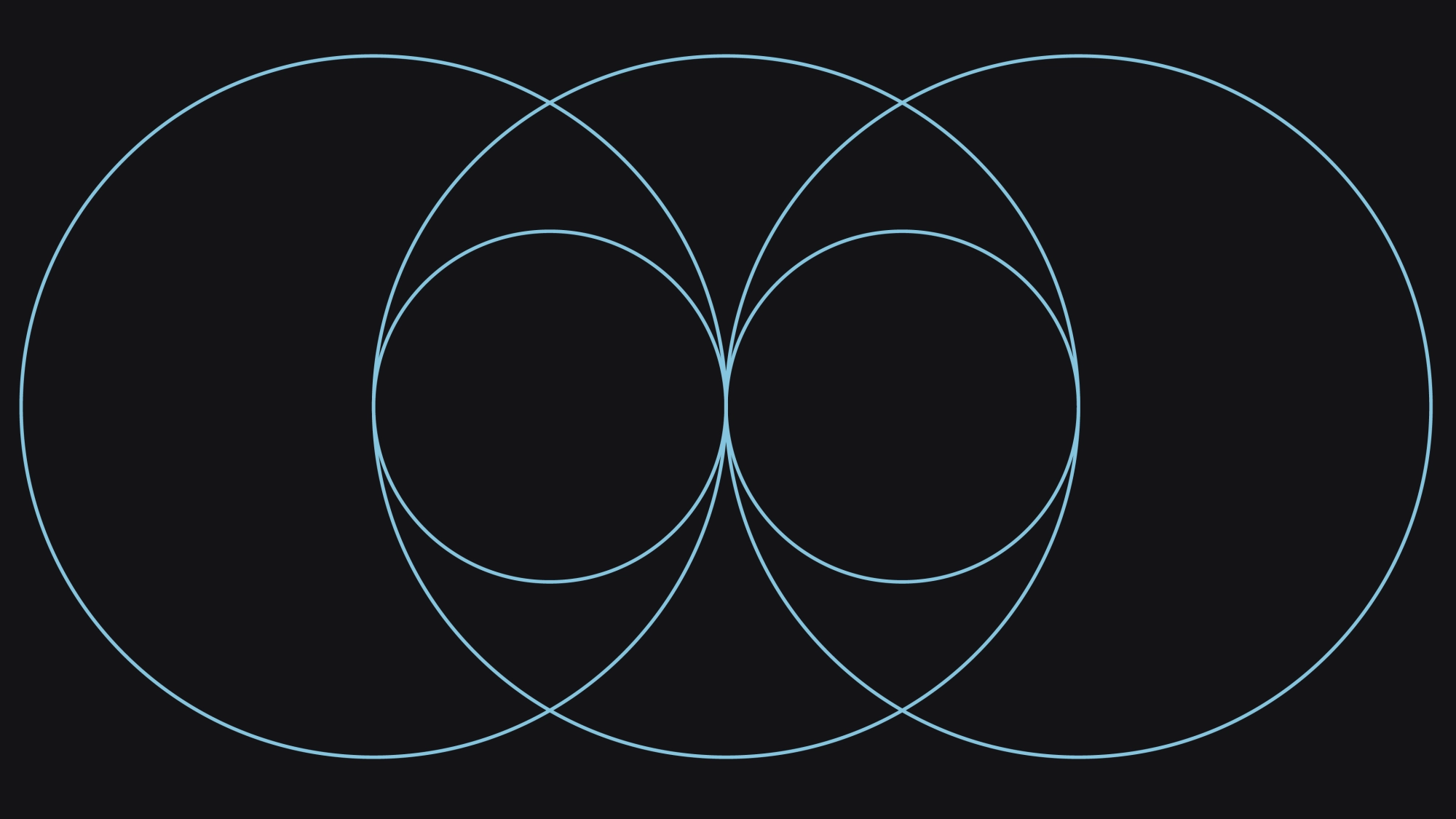
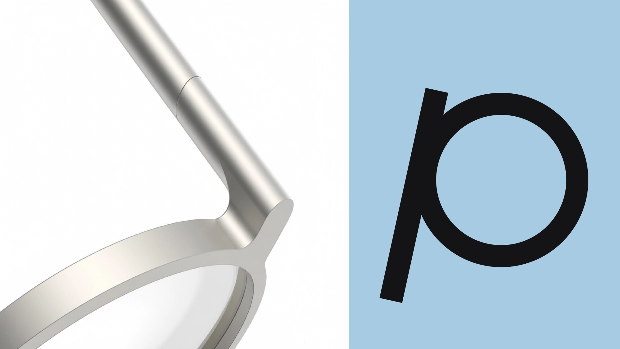
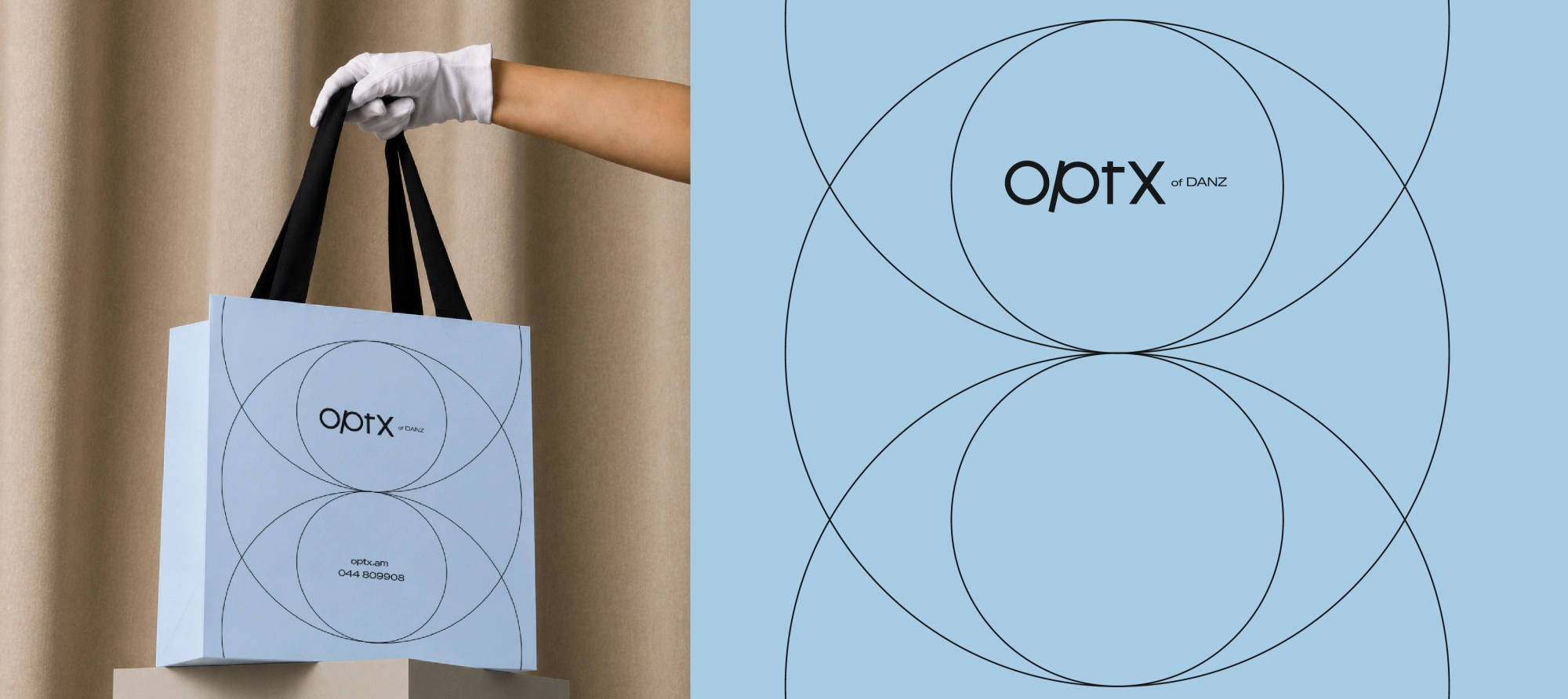
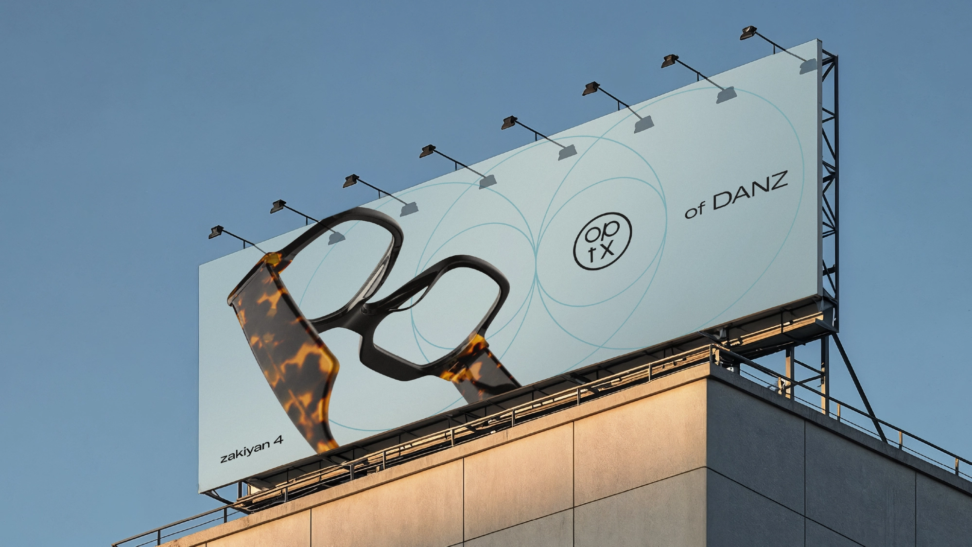
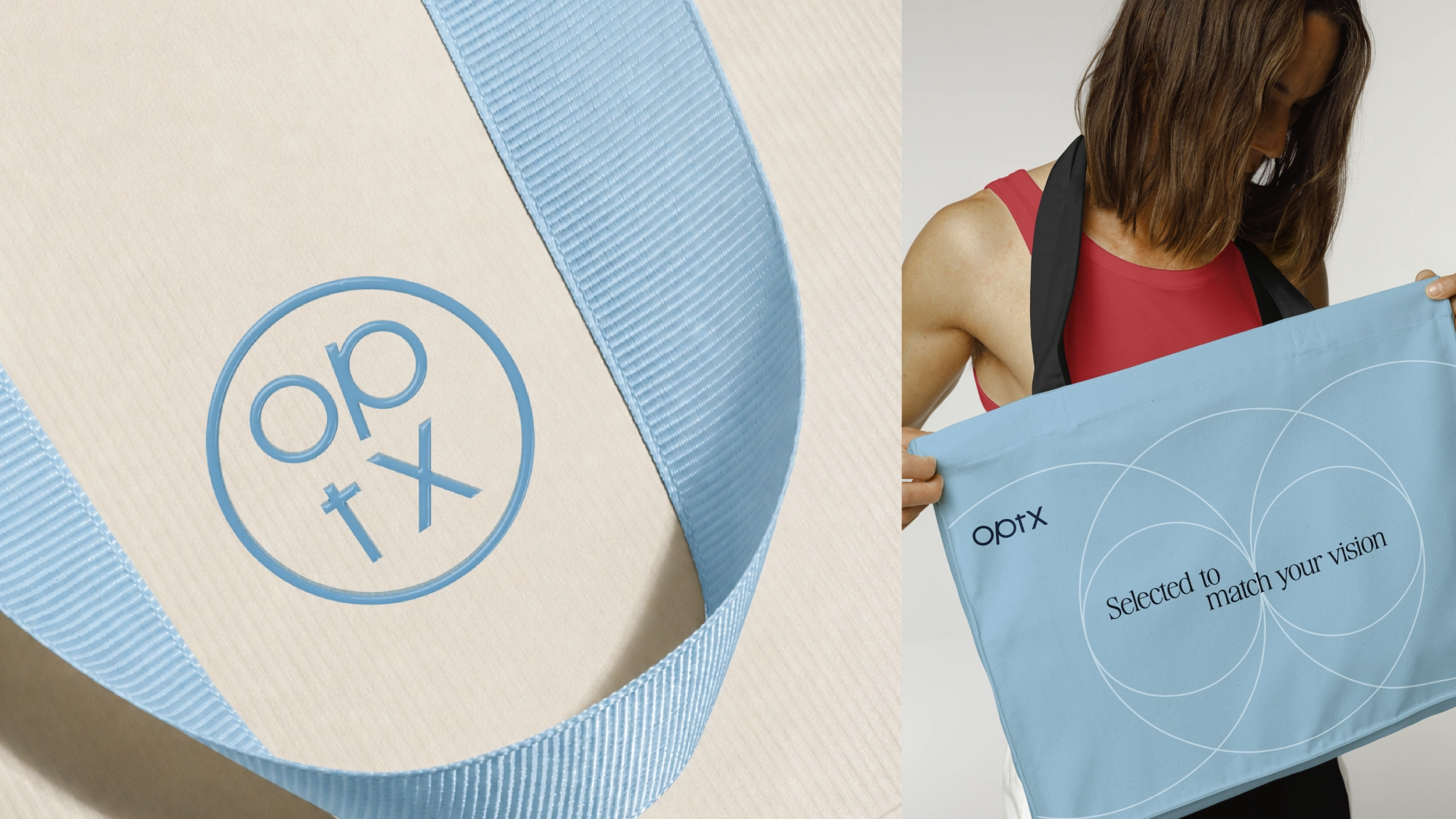
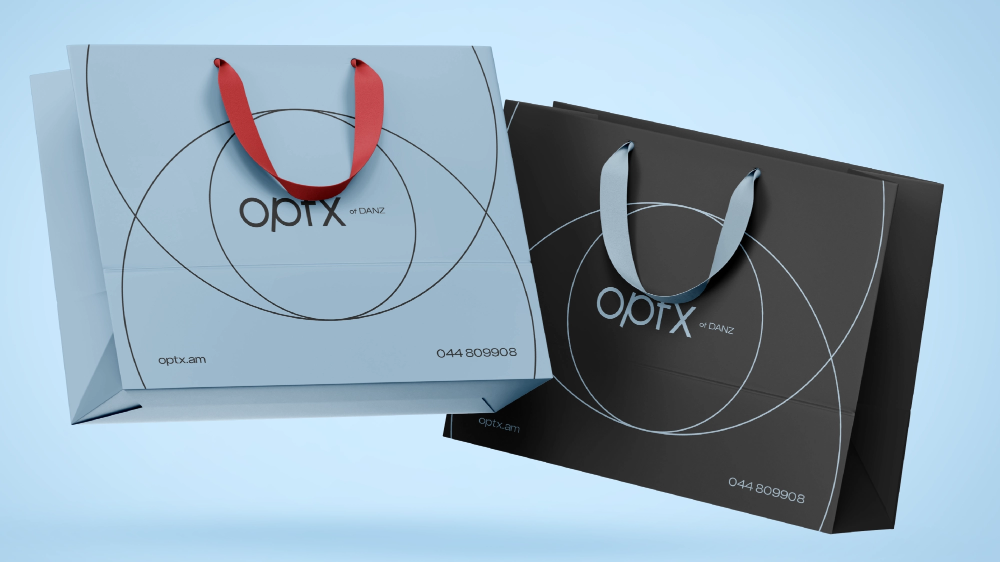
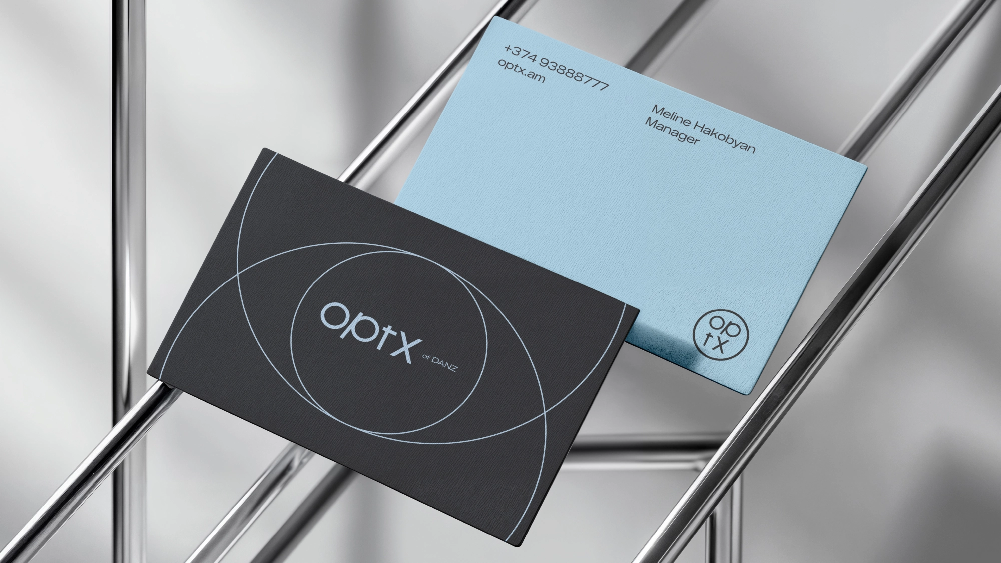
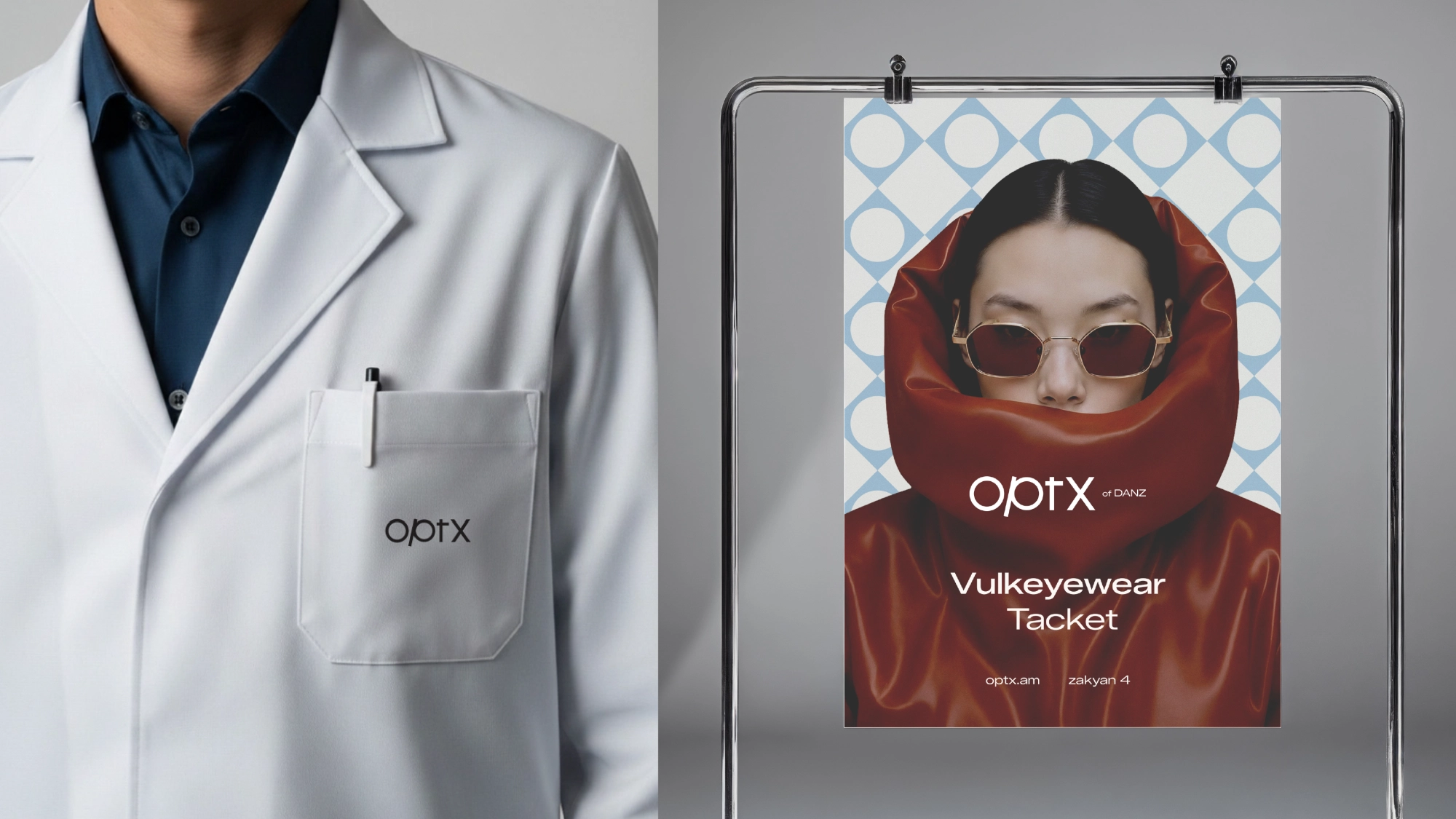
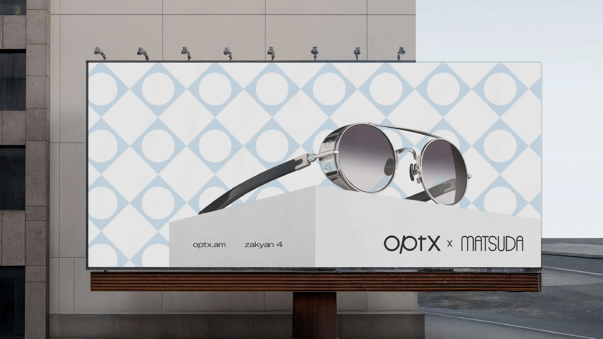
Multibrand eyewear store chain is inspired by the shape of the eye - rounded elements, clean lines and clear compositions. The “p” in the minimalist logo carries the DNA of eyewear through the form of a frame and temple arm.
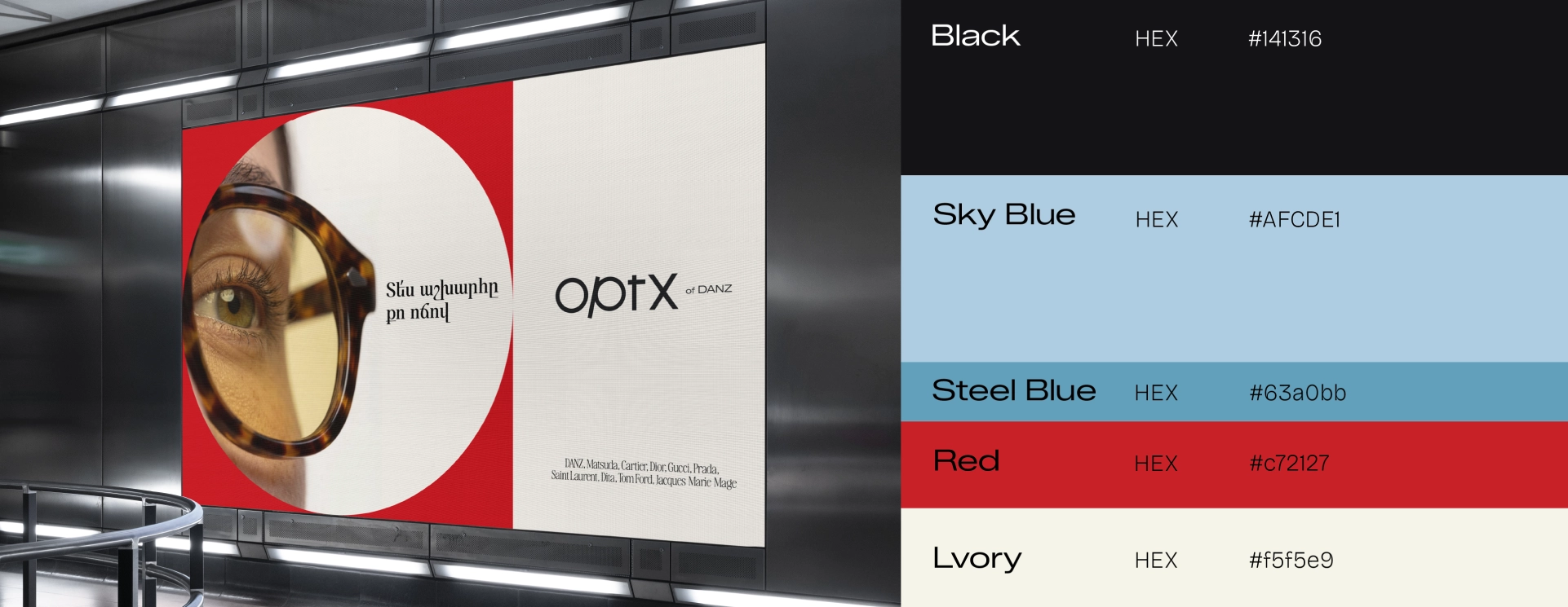
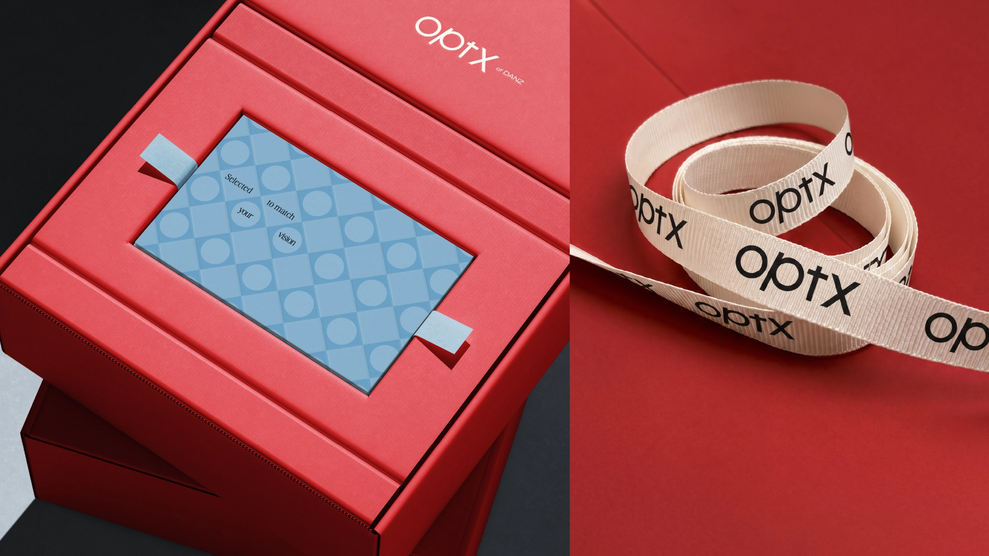
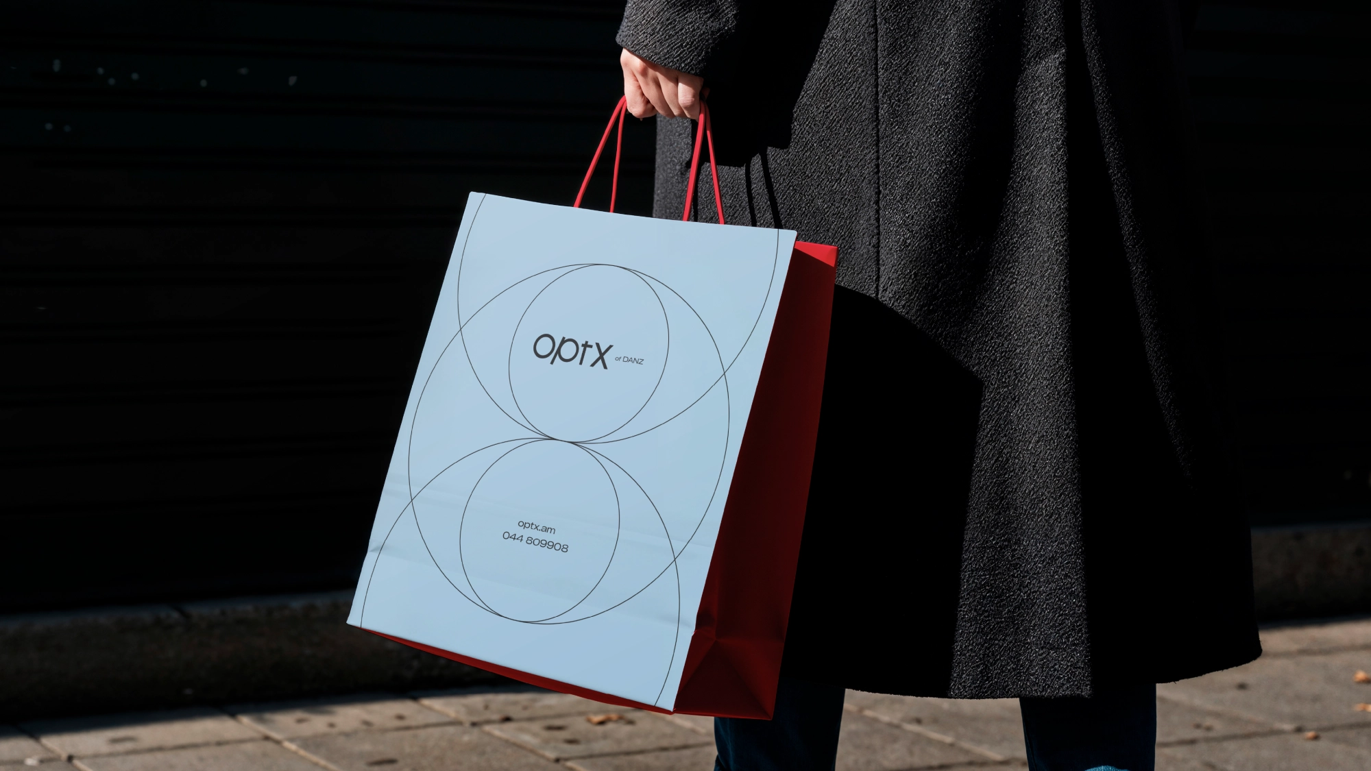
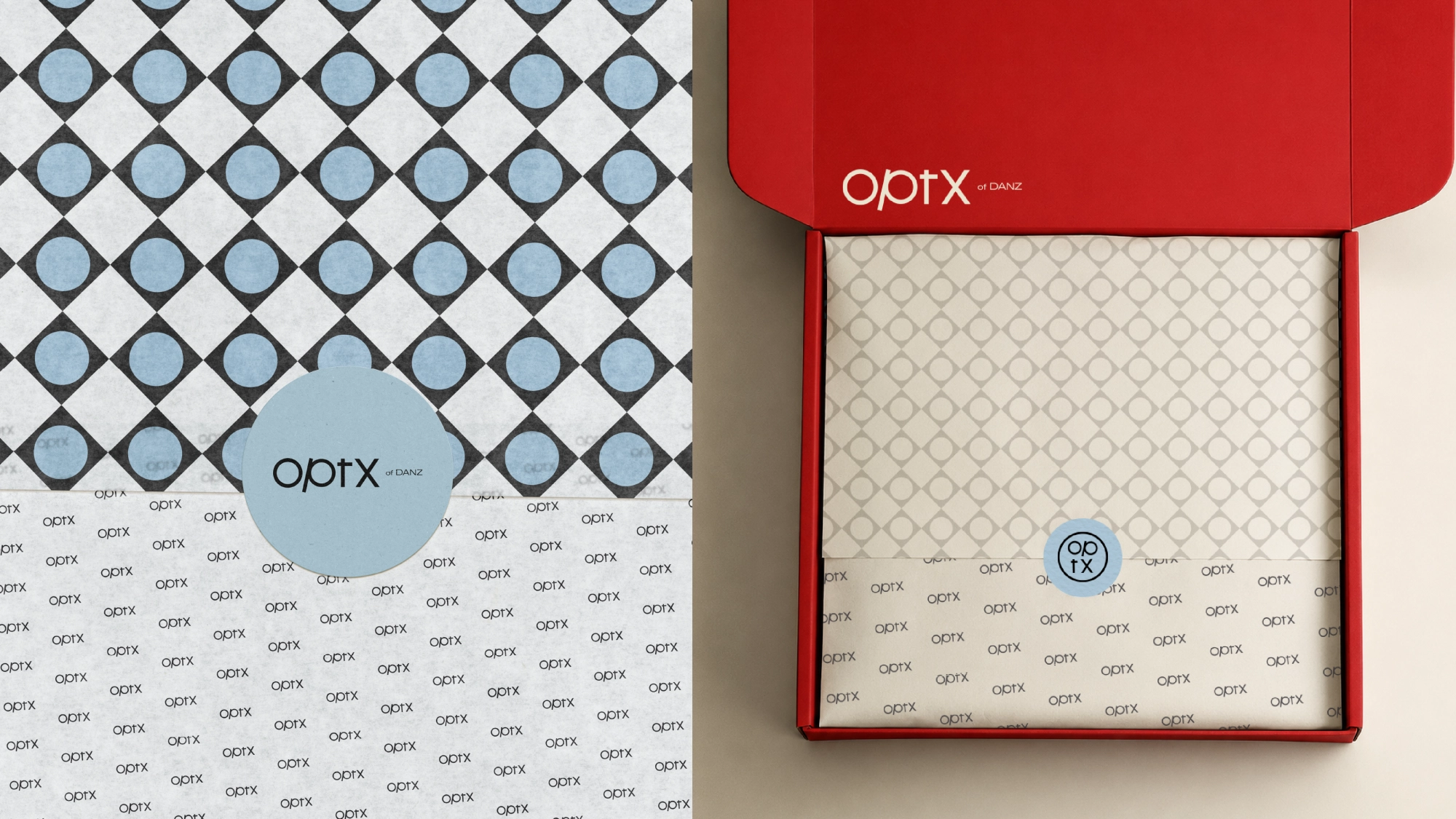
The color palette is built around the same sense of thoughtful balance. Sky blue conveys clarity and purity of vision, while black and off-white give the brand a classic character, creating a calm and confident atmosphere. Red acts as a stylish accent color, adding energy and expressiveness to the entire system.
Everything here revolves around one idea: see the world in your own way by choosing eyewear that becomes an extension of your personality
The color palette is built around the same sense of thoughtful balance. Sky blue conveys clarity and purity of vision, while black and off-white give the brand a classic character, creating a calm and confident atmosphere. Red acts as a stylish accent color, adding energy and expressiveness to the entire system.
Everything here revolves around one idea: see the world in your own way by choosing eyewear that becomes an extension of your personality
Team Involved
Karen Babajanyan / Founder & Branding Director
Anya Andranikyan / Art Director
Tatevik Harutyunyan / Project Manager
Vahe Mesropyan / Graphic designer


More works
All works
G.CODER
Technology Hub

Goran's Butchery
German Butcher Shop