


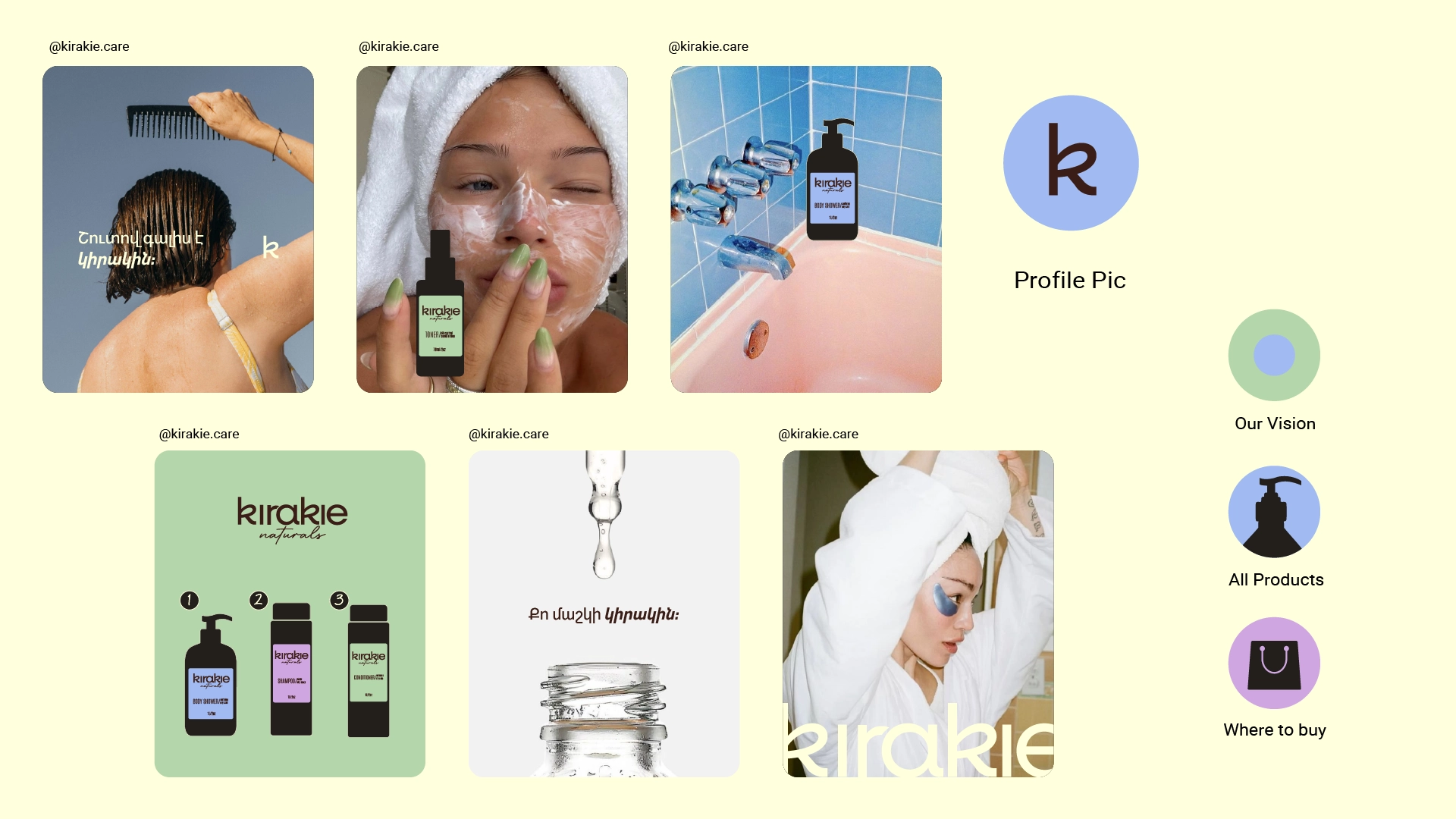
About
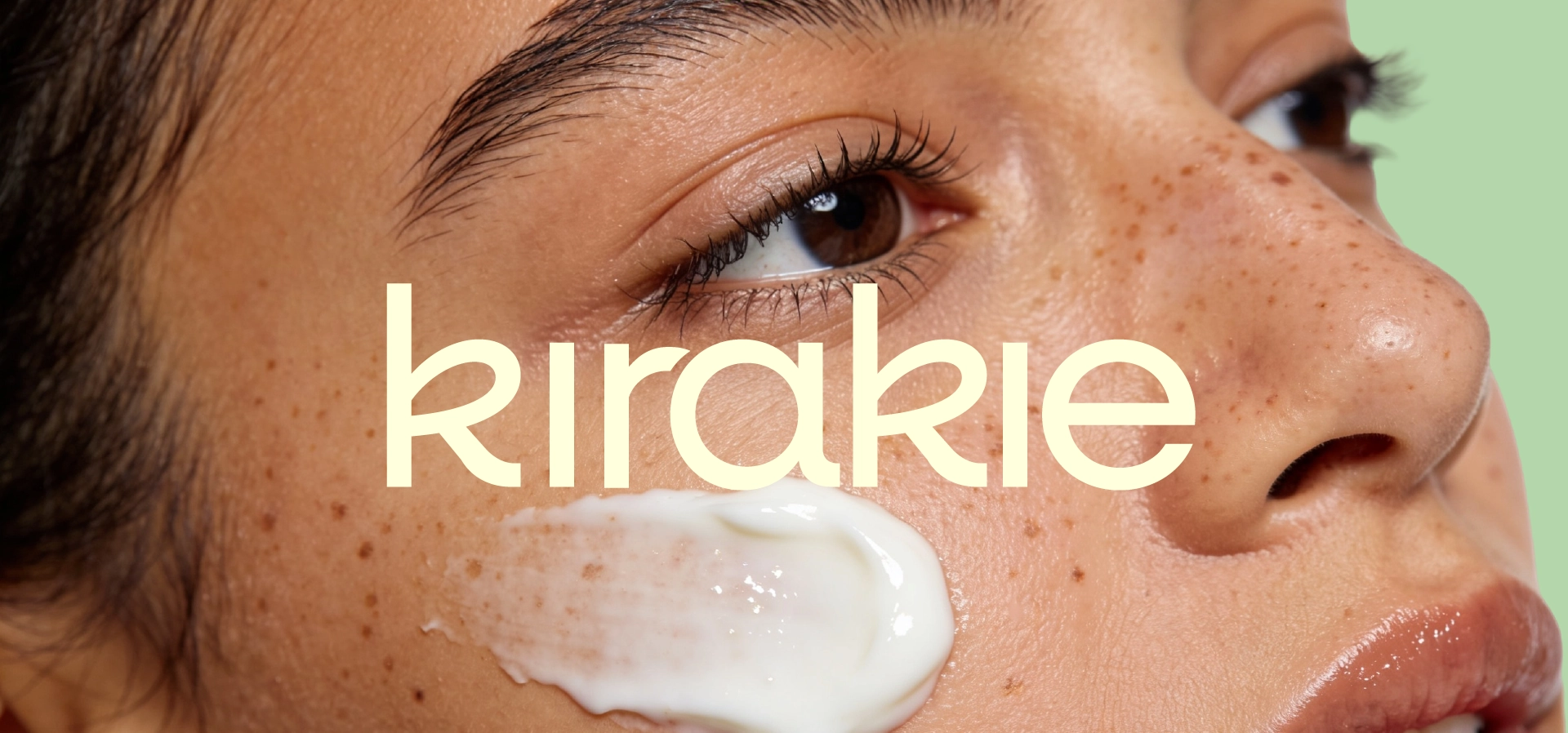
Kirakie is more than skincare
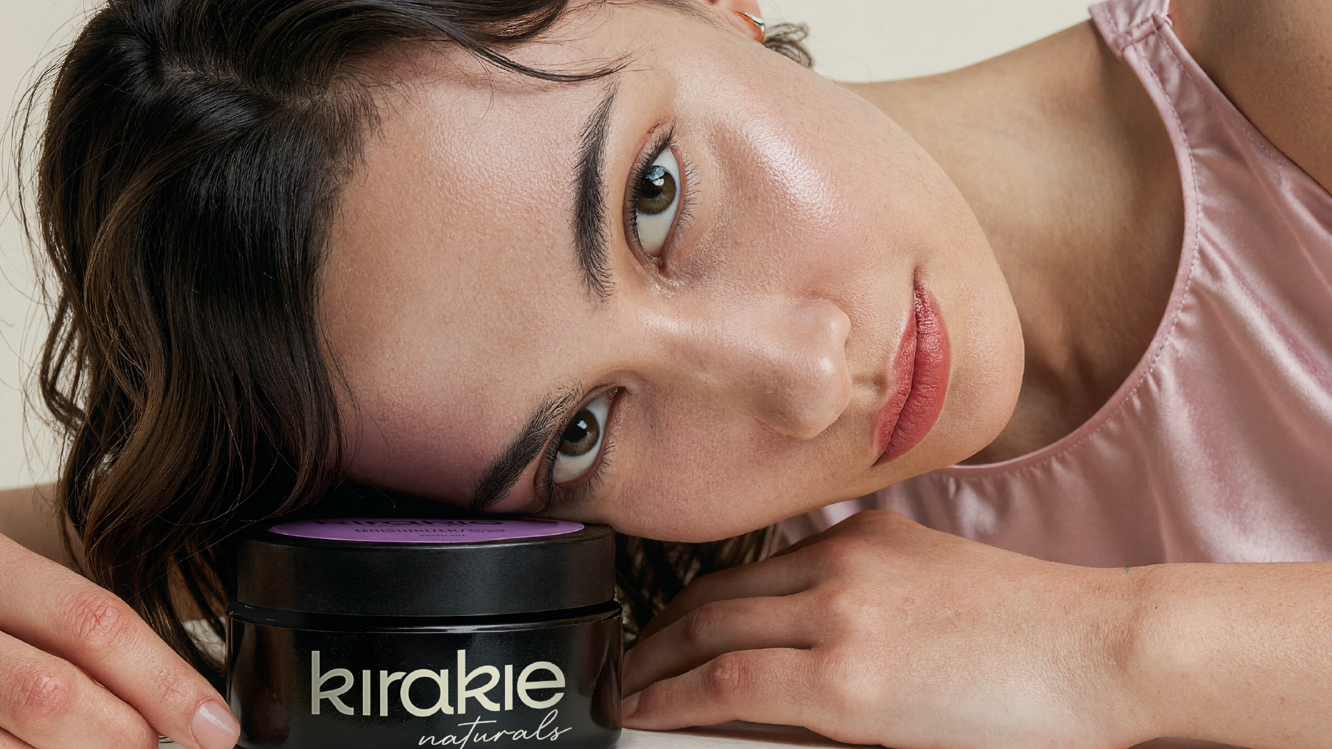
It is about personal space, self - care and a sense of balance.
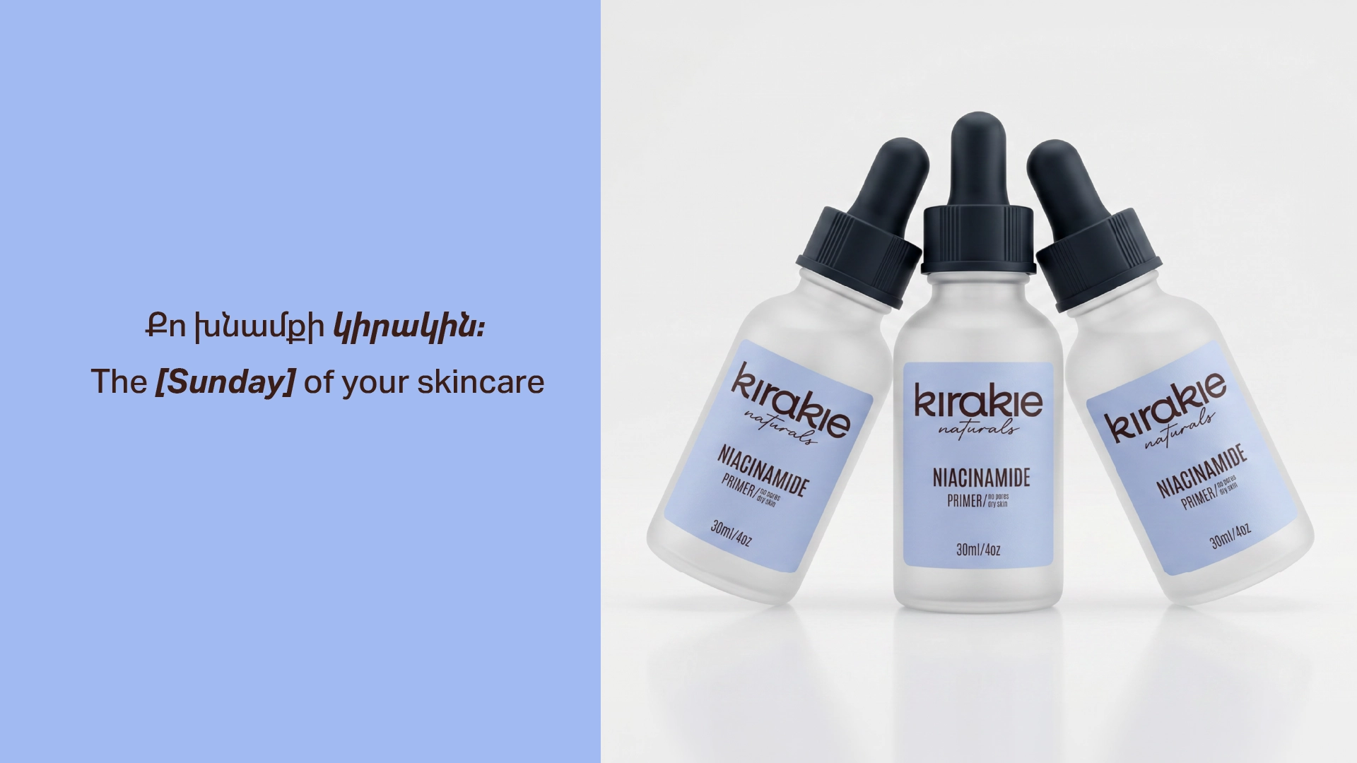
As the largest organ of the human body, our skin requires constant attention and care. Just as we dedicate Sundays to rest, recharge and take care of ourselves, our skin also needs time to recover, renew and be nourished.
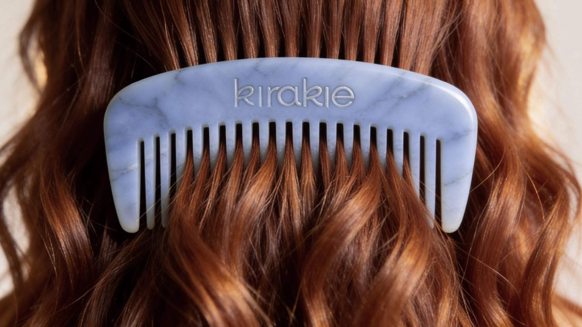
This idea became the foundation of the brand name - Kirakie. Fresh, positive and distinctly Armenian, it carries a strong local identity while remaining fully competitive in the international market.
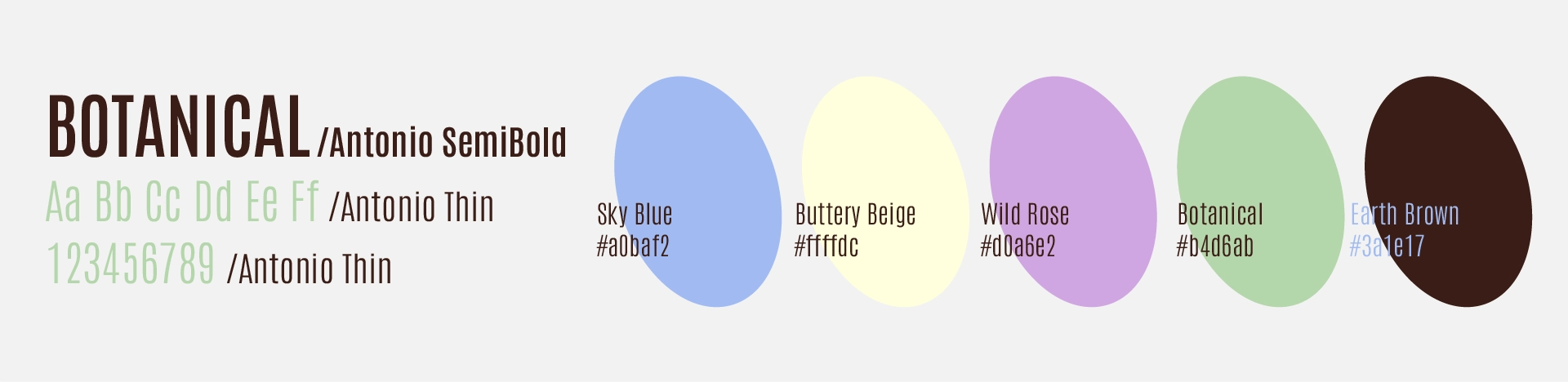
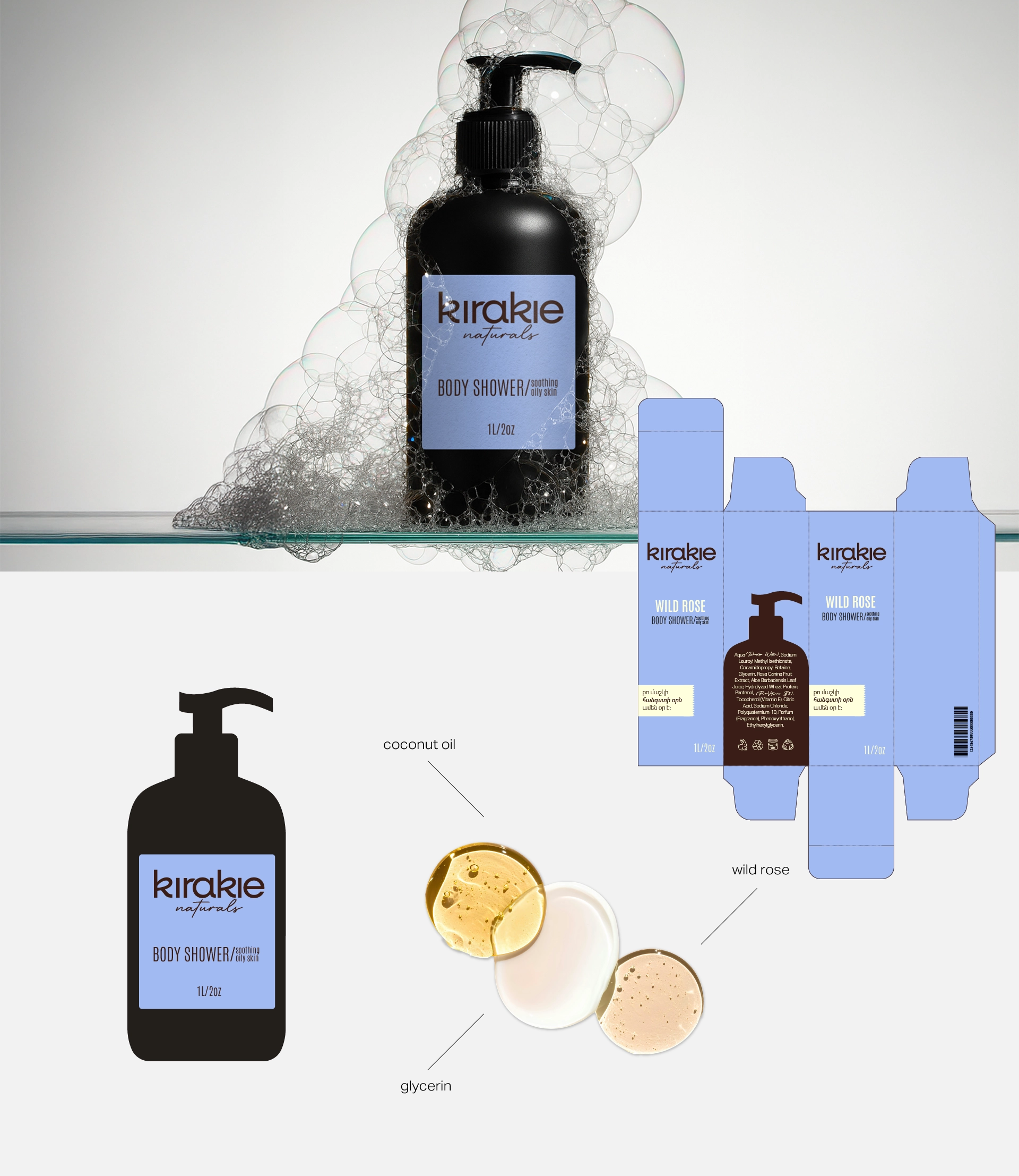
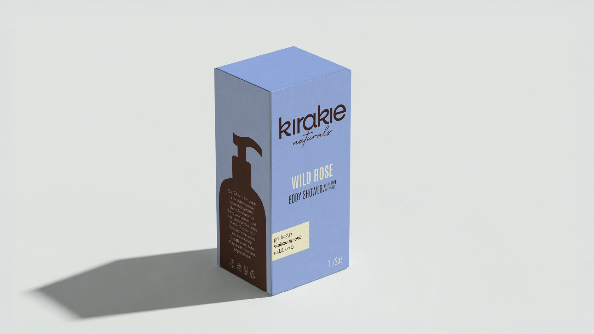
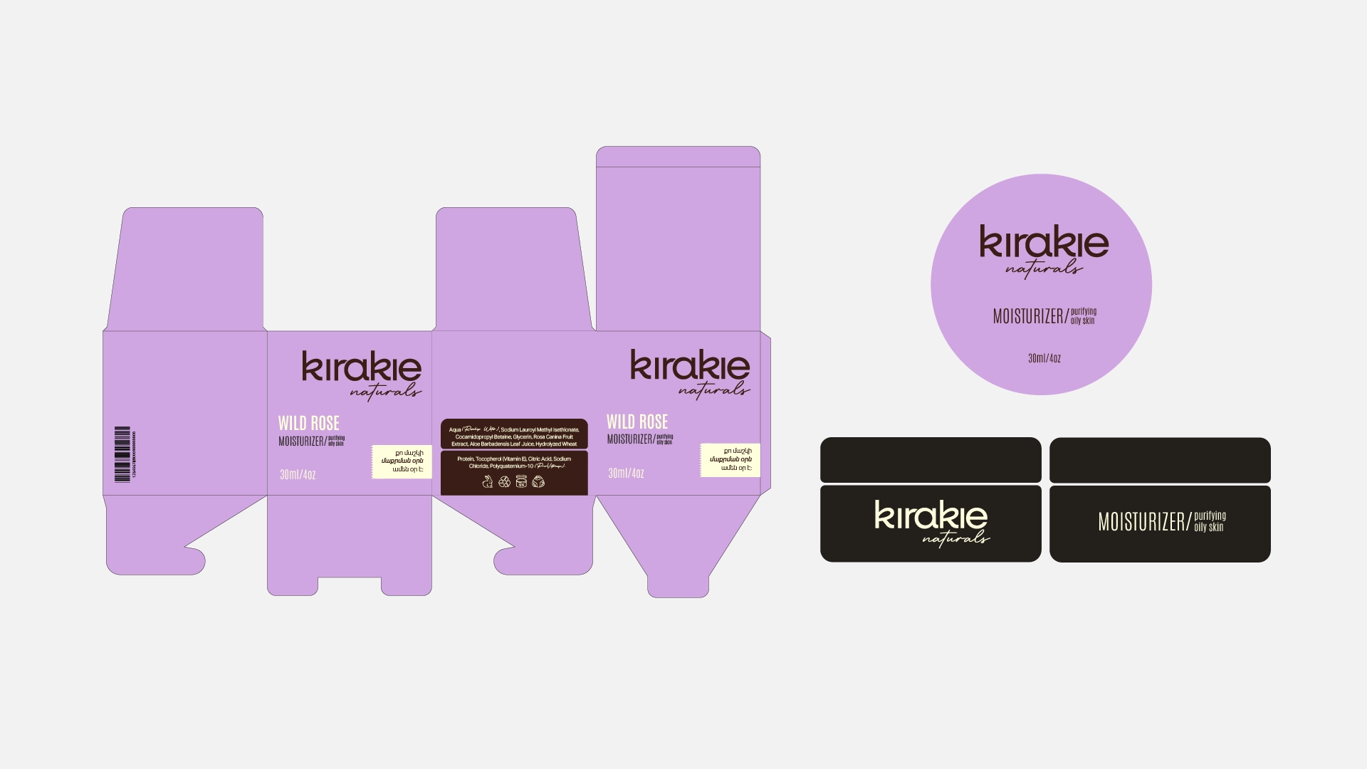
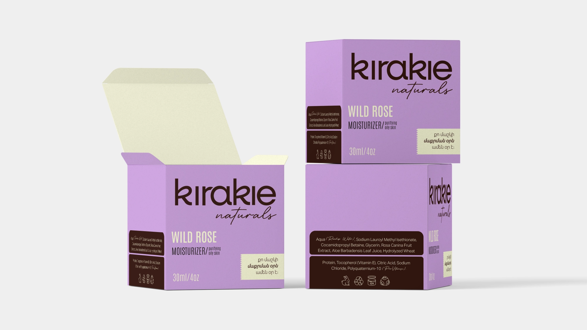
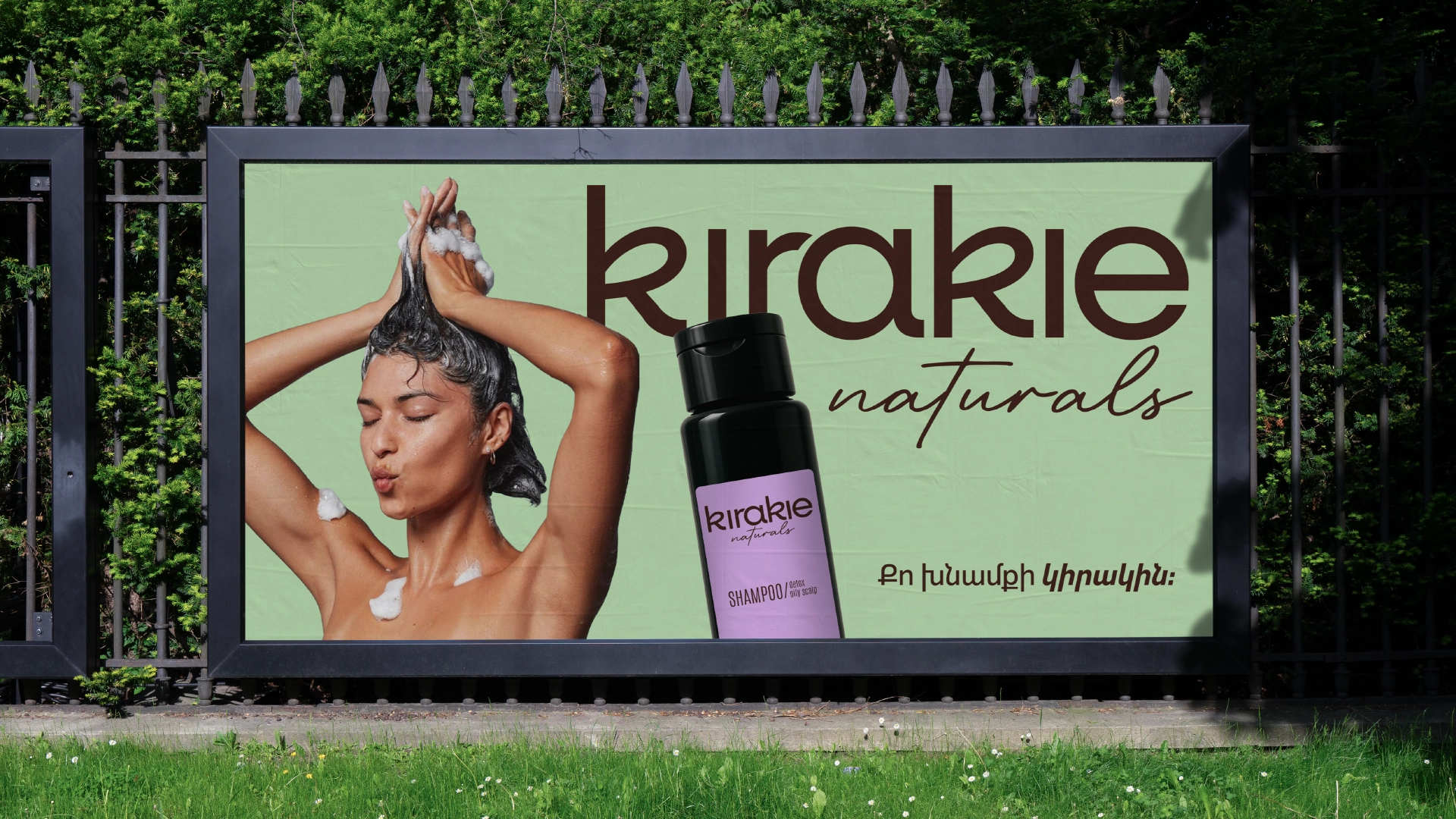
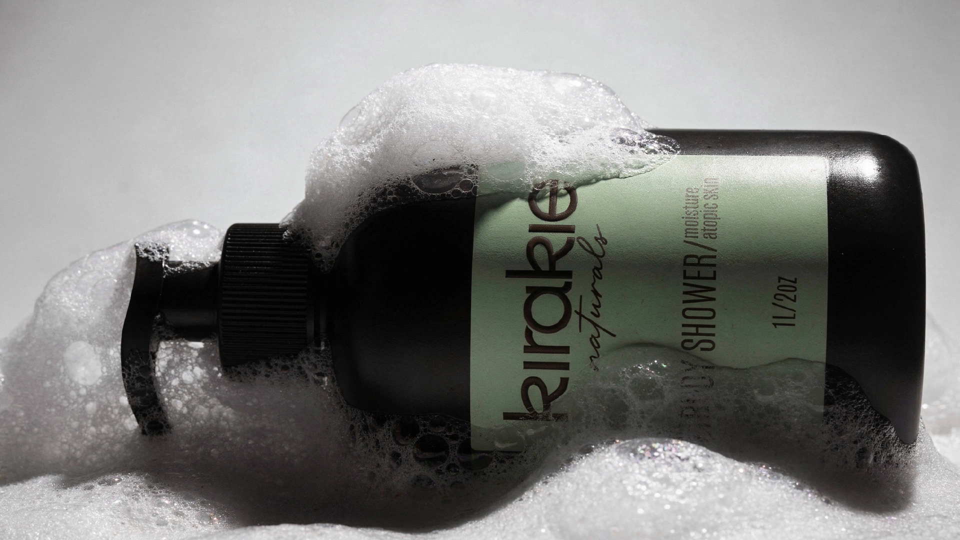
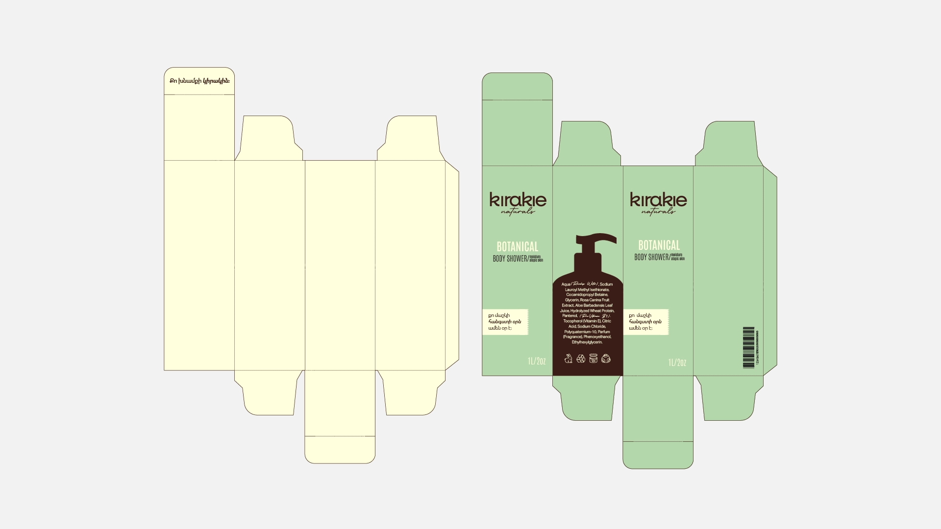
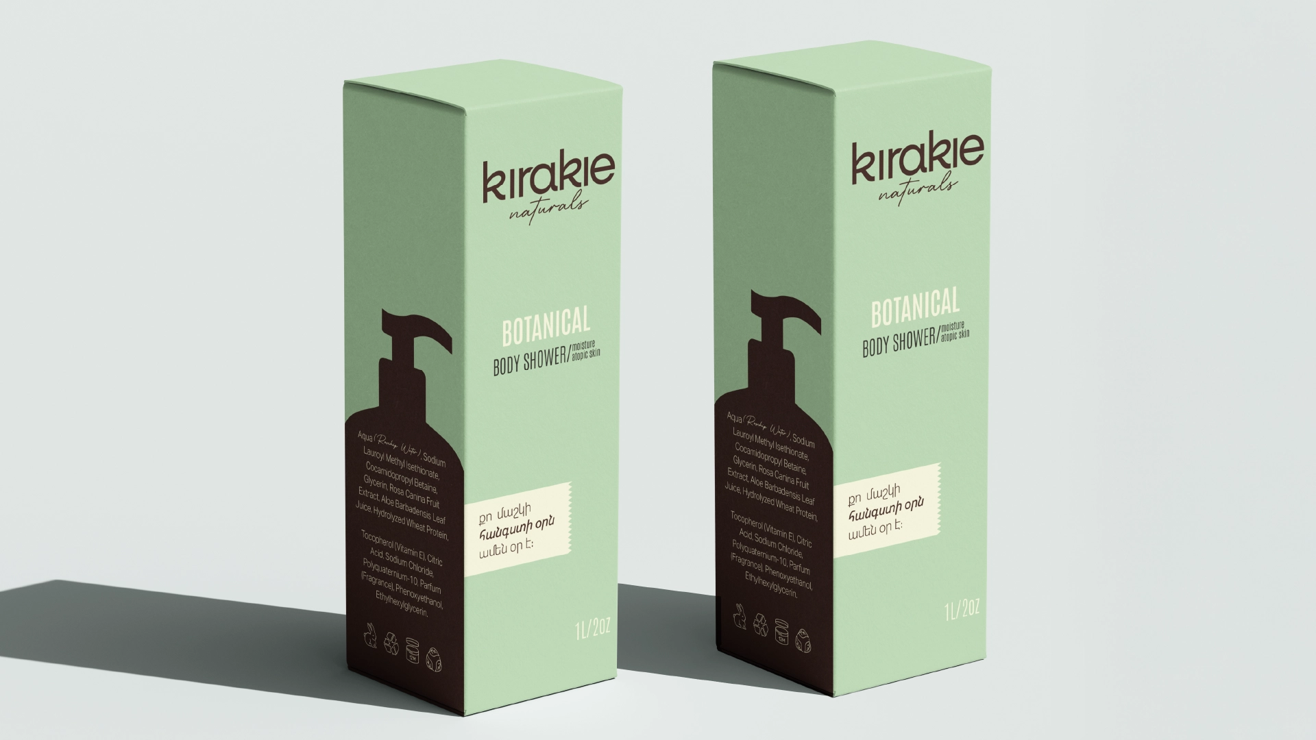
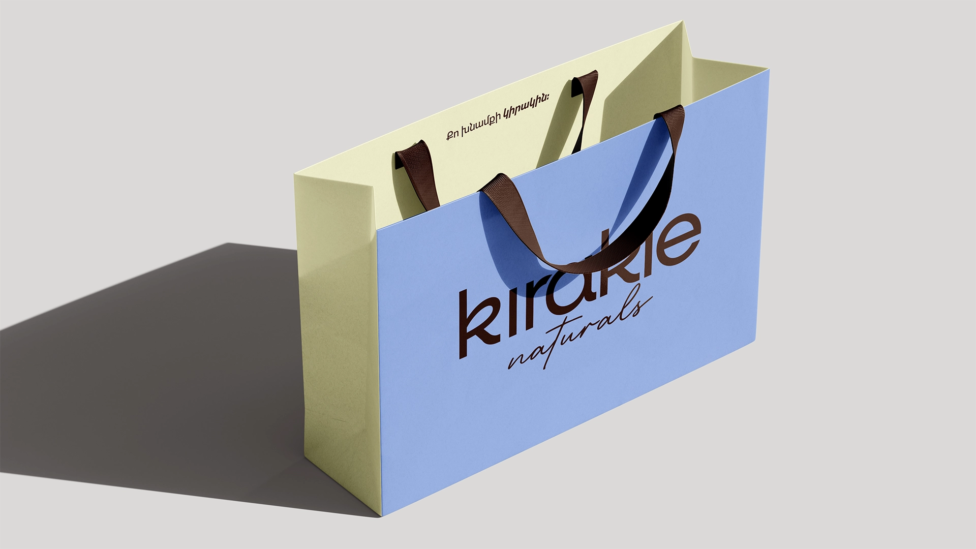
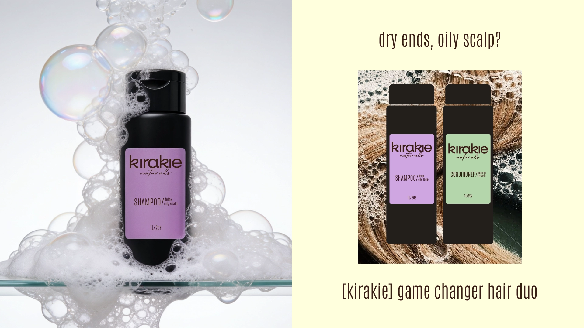
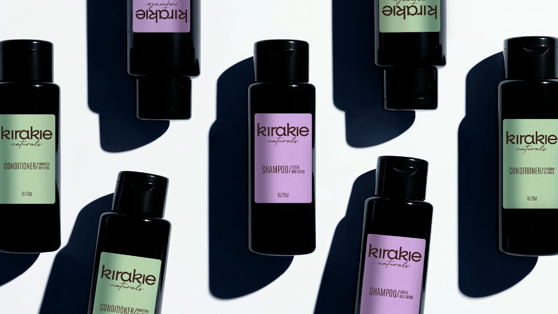
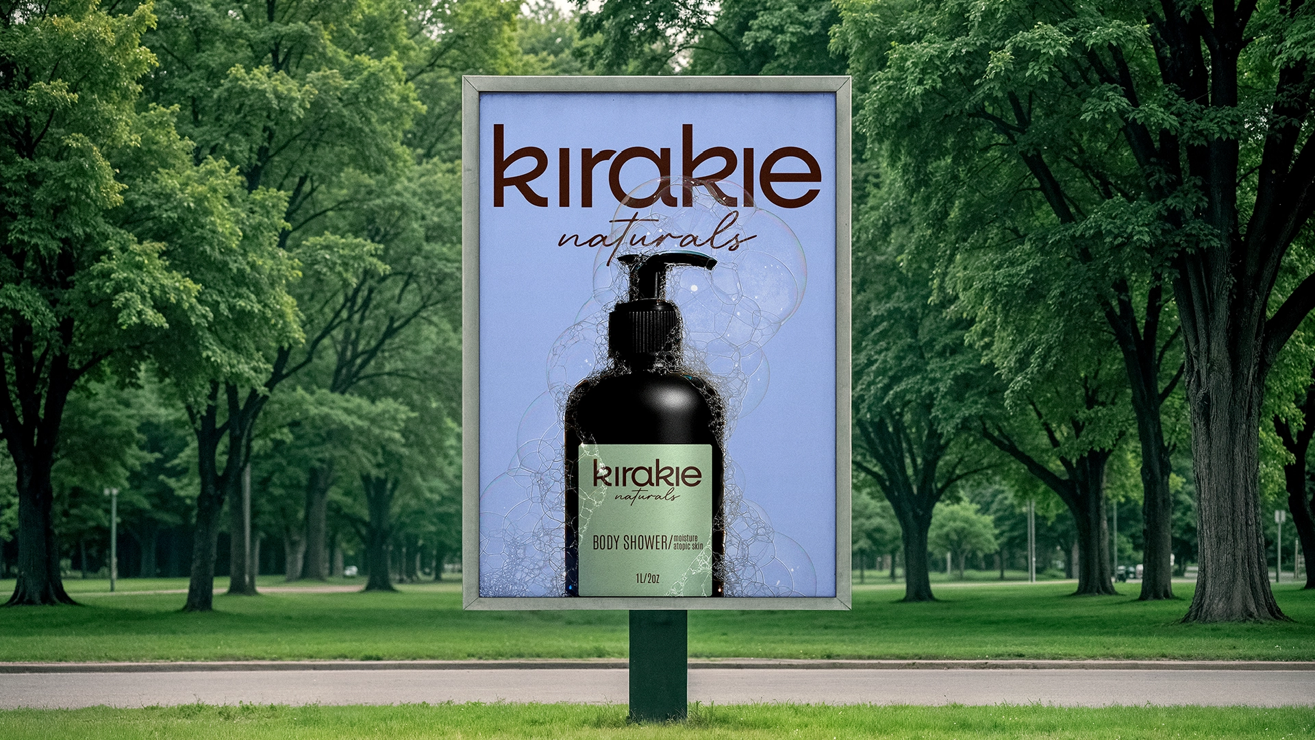
The color palette is soft and grounding, drawn from nature: brown for earth, blue for sky, green for growth.
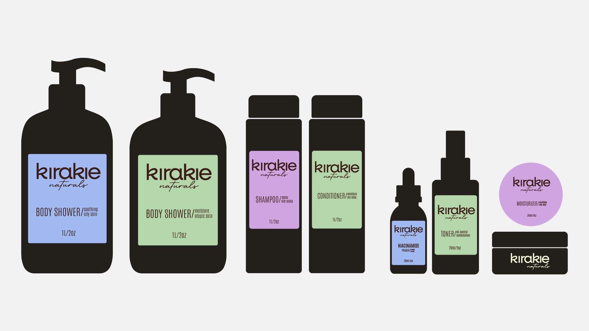
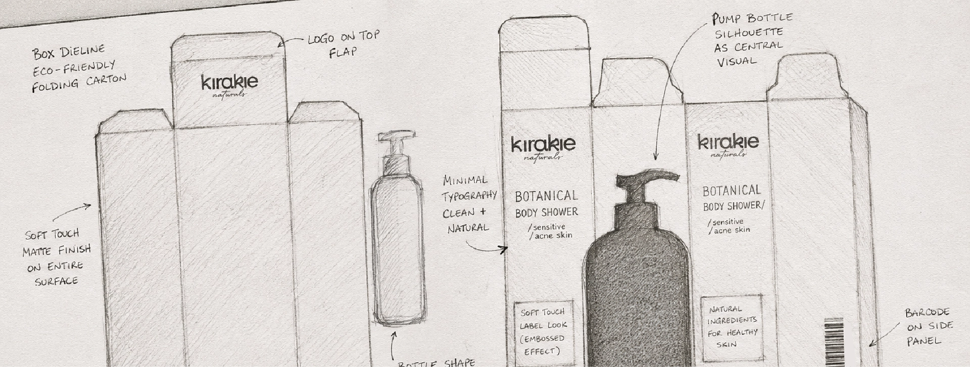
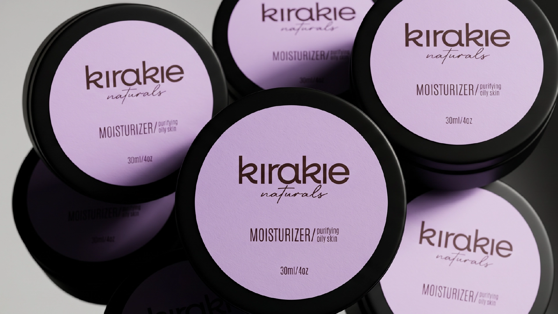
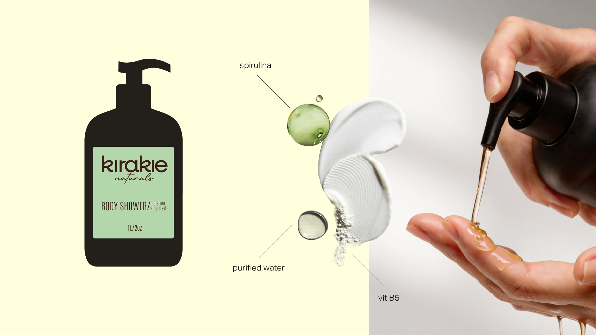
The packaging follows the same philosophy - minimal, clean and intentional.
No unnecessary visual noise, only a clear focus on the information that matters most.
As the largest organ of the human body, our skin requires constant attention and care. Just as we dedicate Sundays to rest, recharge and take care of ourselves, our skin also needs time to recover, renew and be nourished.
This idea became the foundation of the brand name - Kirakie. Fresh, positive and distinctly Armenian, it carries a strong local identity while remaining fully competitive in the international market.
The color palette is soft and grounding, drawn from nature: brown for earth, blue for sky, green for growth.
The packaging follows the same philosophy - minimal, clean and intentional.
No unnecessary visual noise, only a clear focus on the information that matters most.
Team Involved
Karen Babajanyan / Founder & Branding Director
Anya Andranikyan / Art Director / Graphic Designer
Tatevik Harutyunyan / Project Manager

Related works
All works
The GYM
Fitness Space
BoldItalic
Restaurant