

Kaffa
About
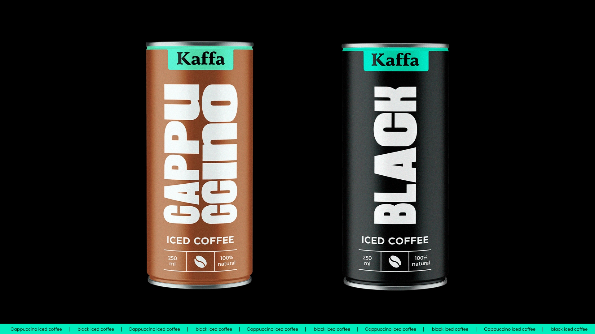
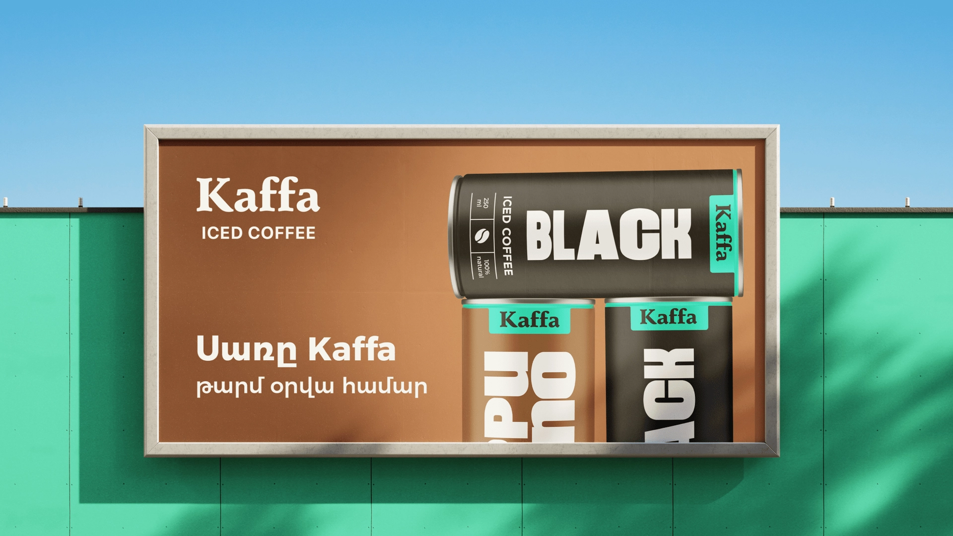
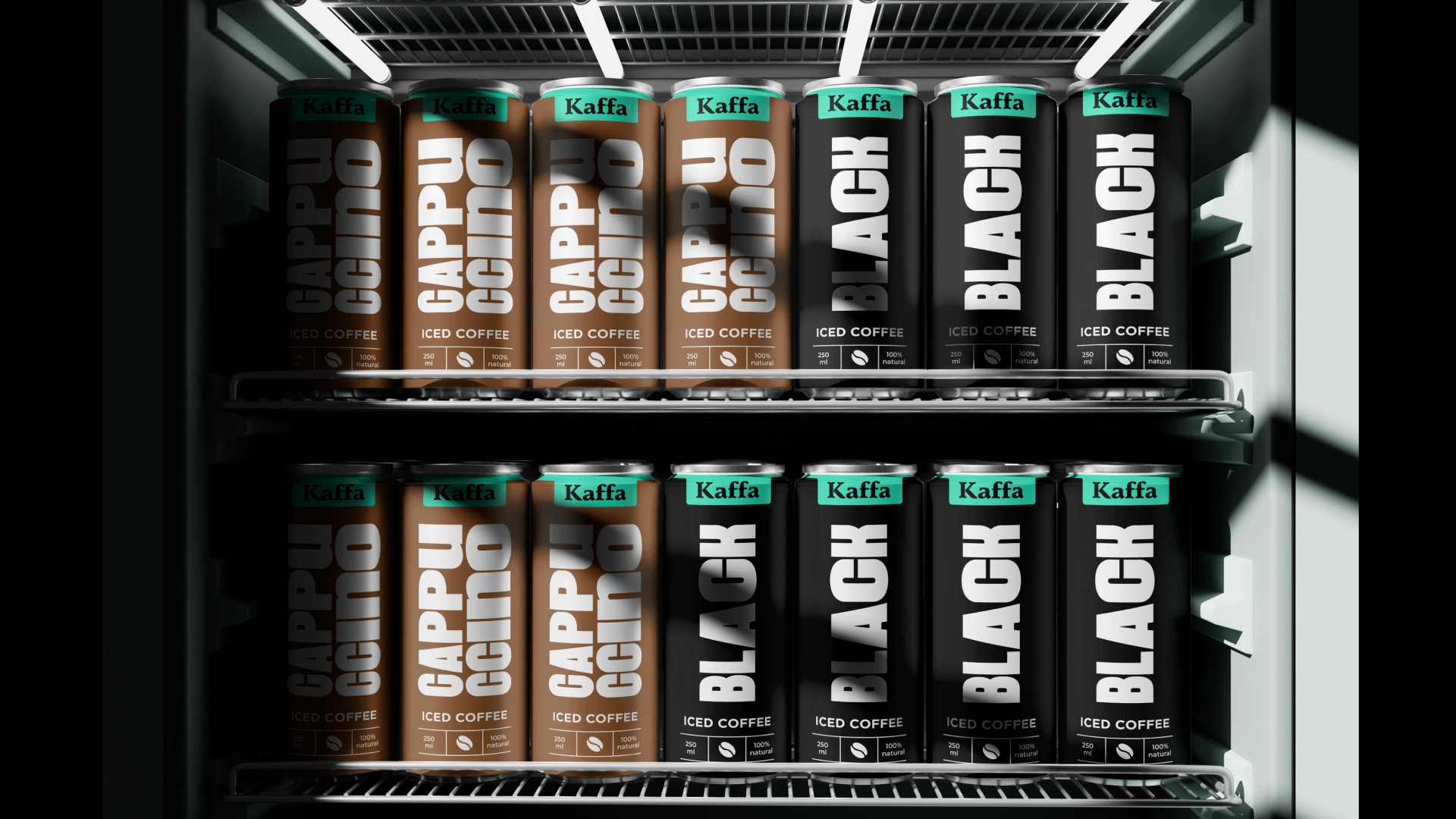
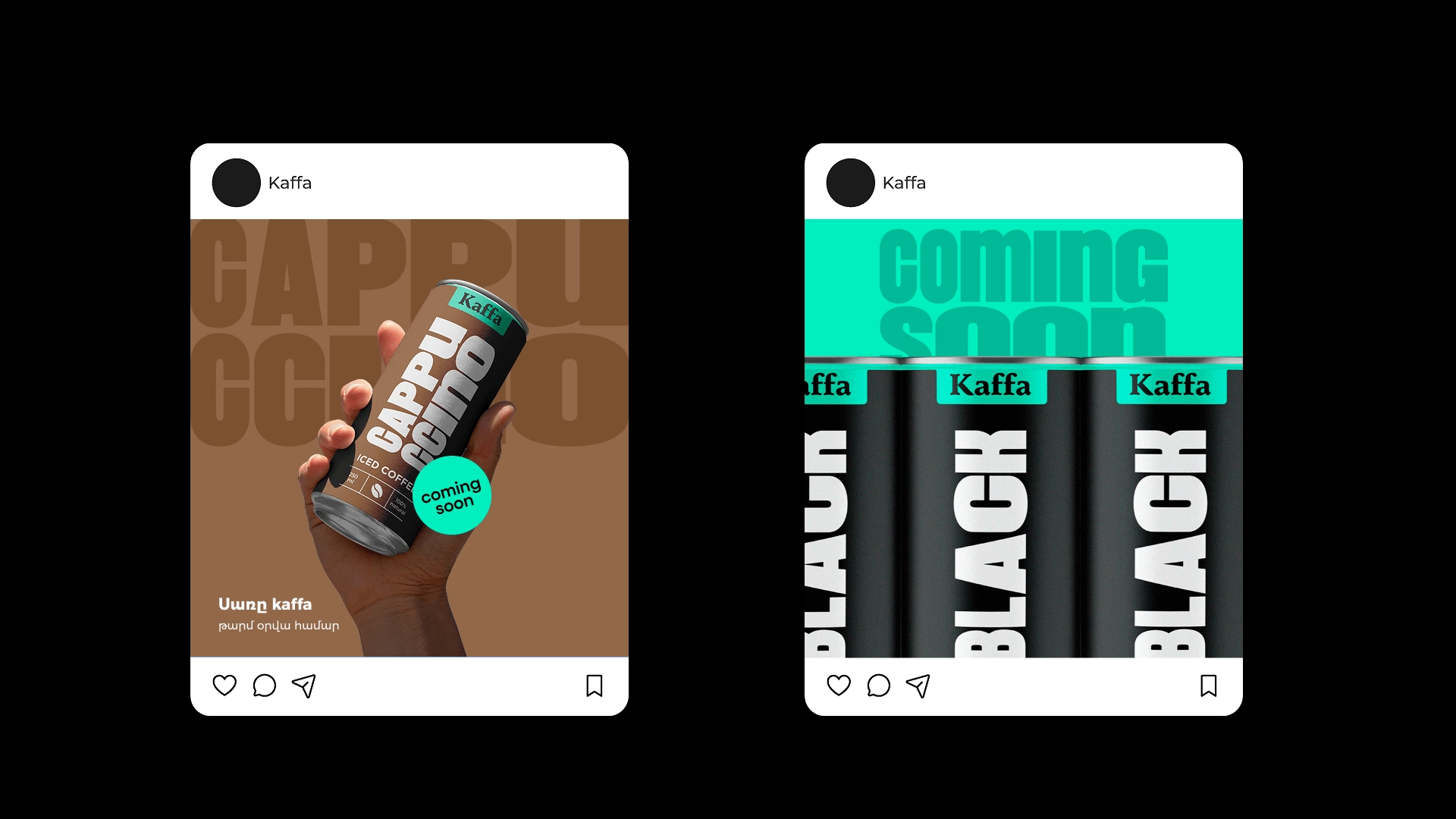
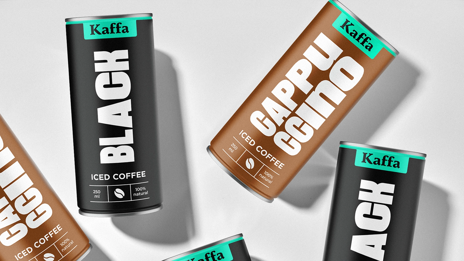
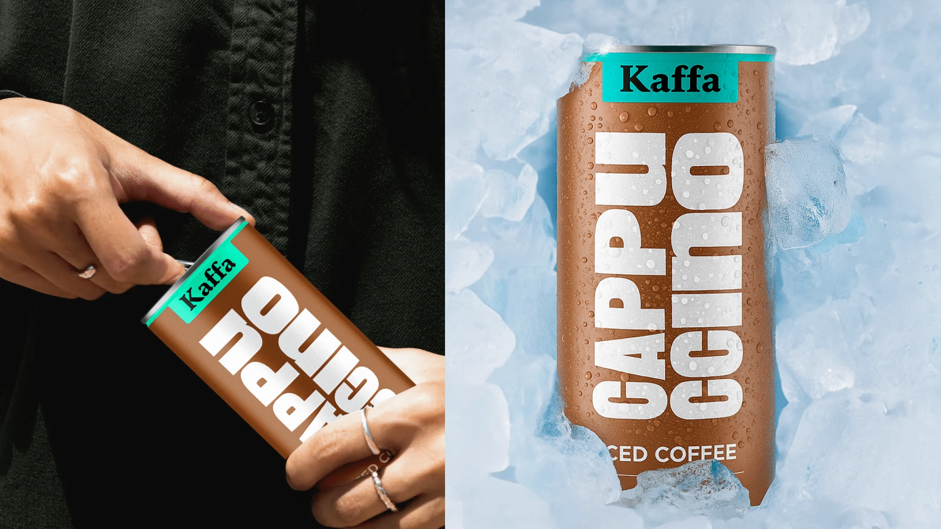
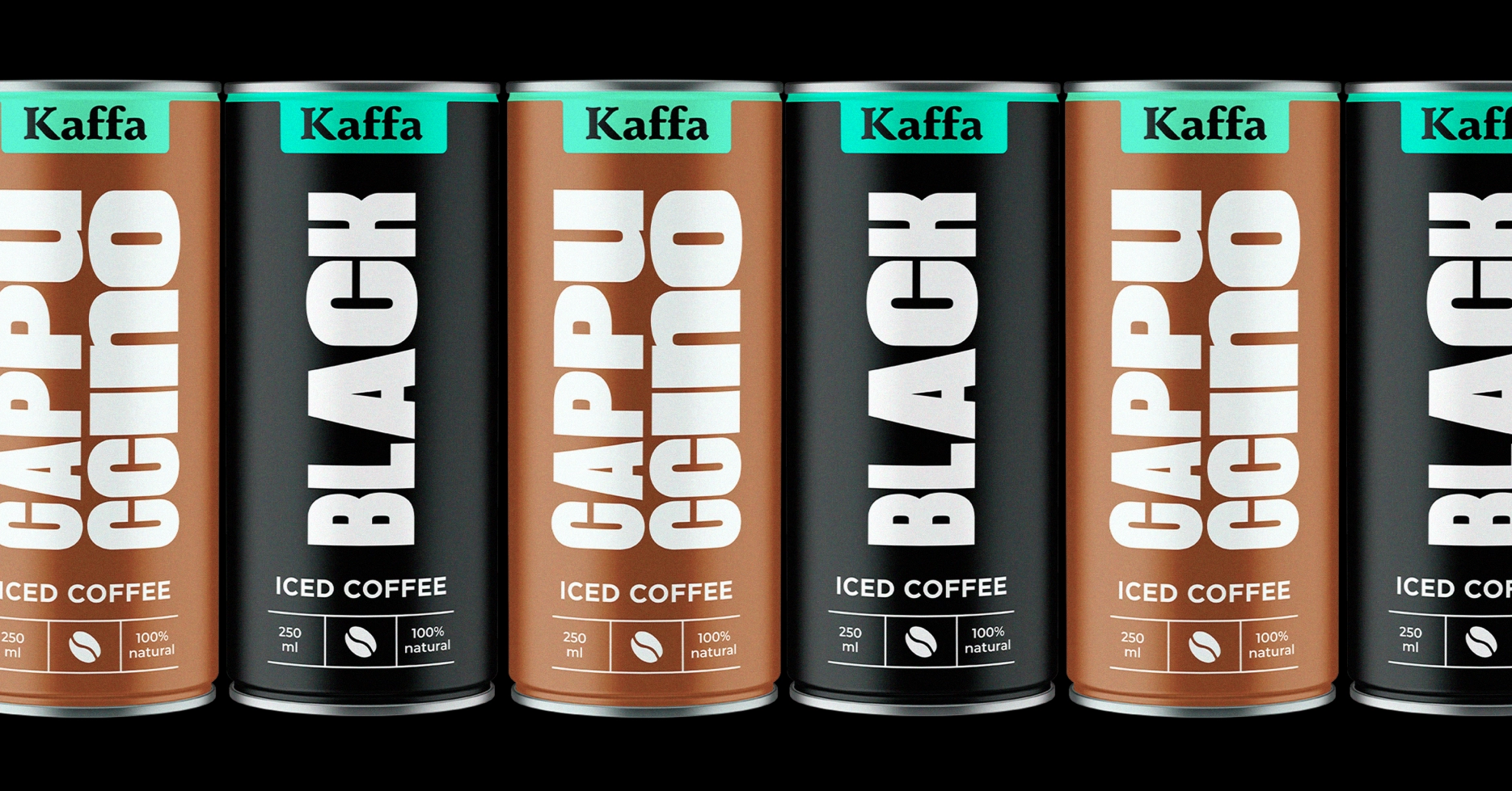
Packaging Design for Kaffa’s Iced Coffee
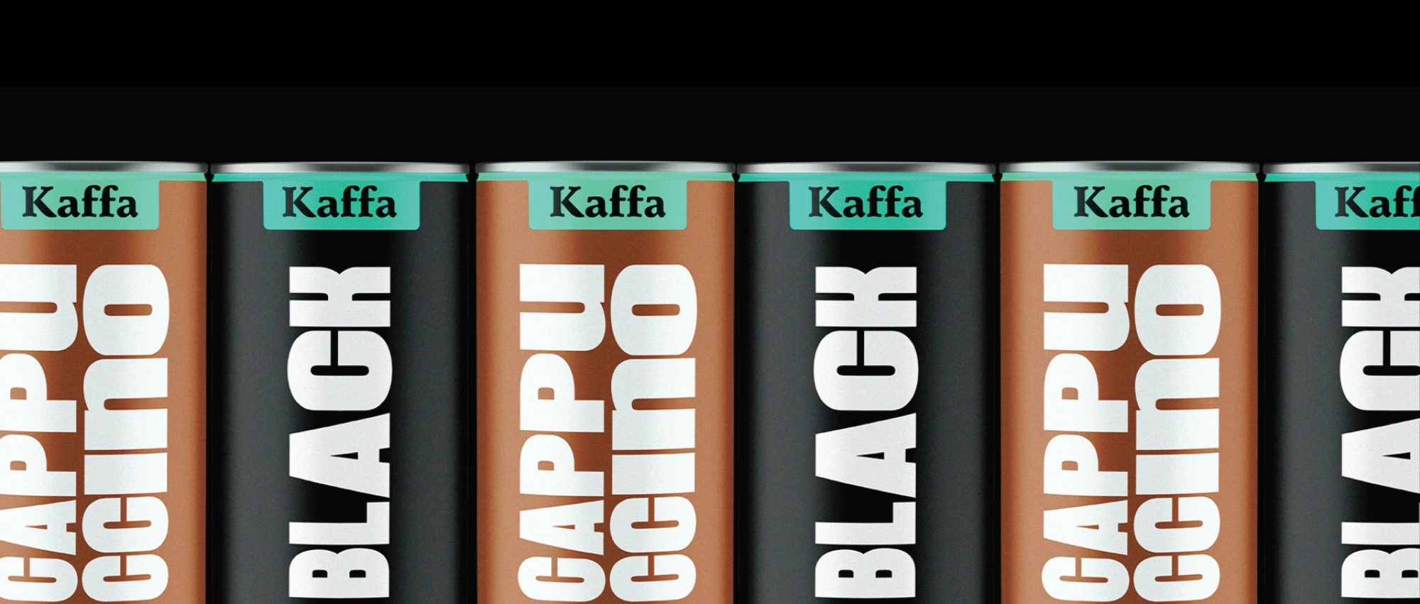
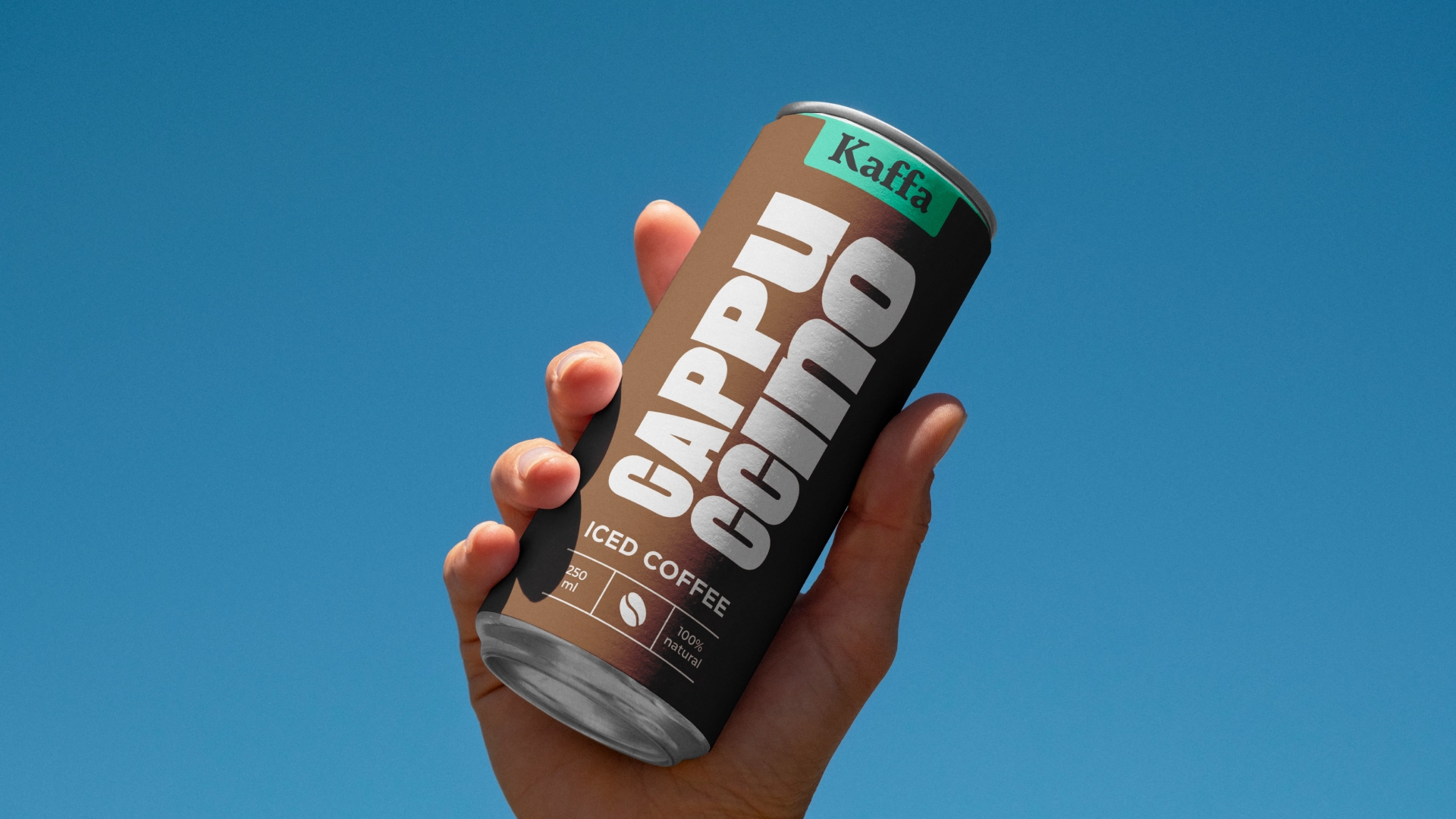
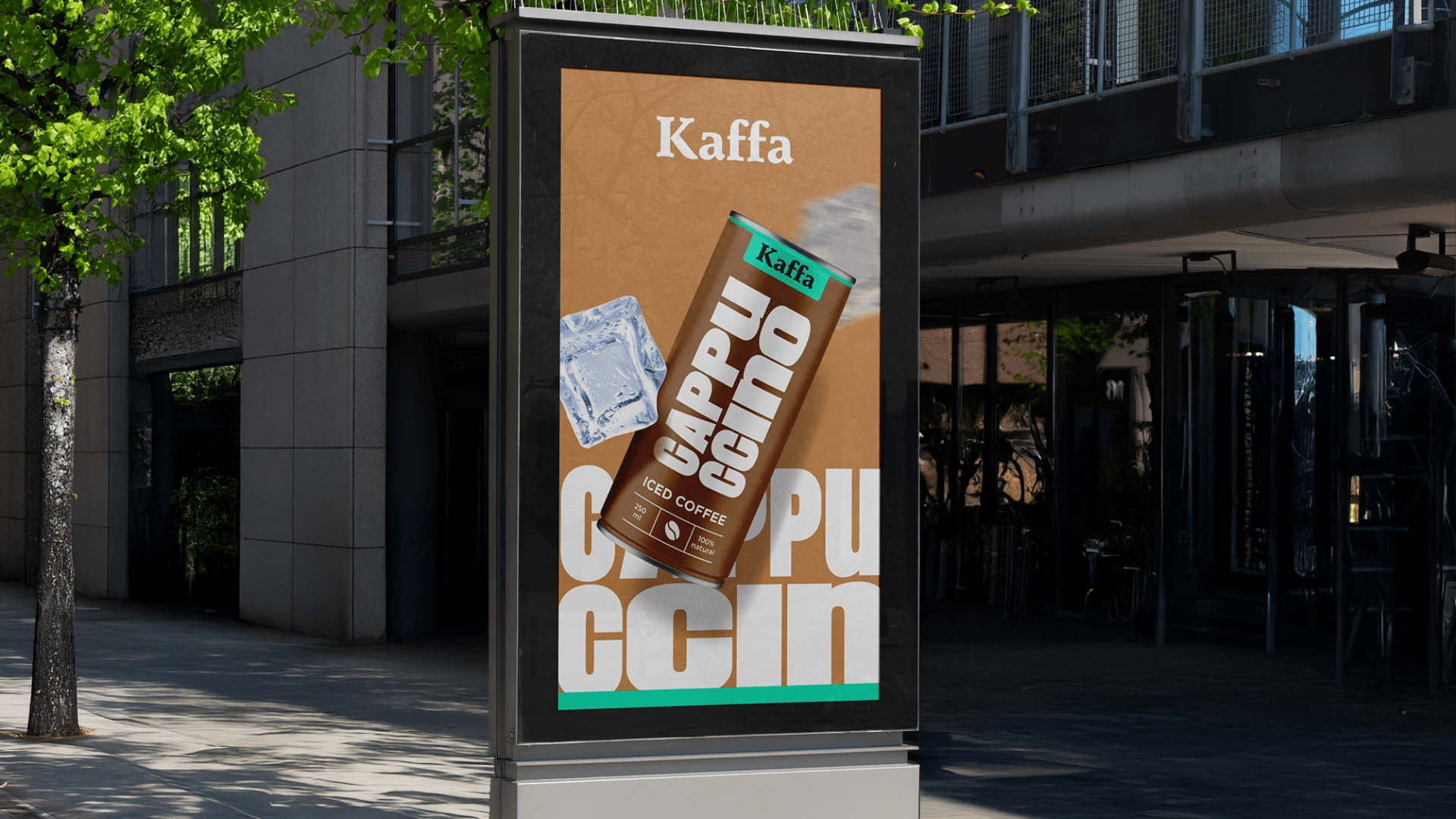
The main challenge was to create a design that conveys associations of freshness, coolness, and energy - one that not only stands out and attracts attention on the shelf but also remains consistent with Kaffa’s overall style.
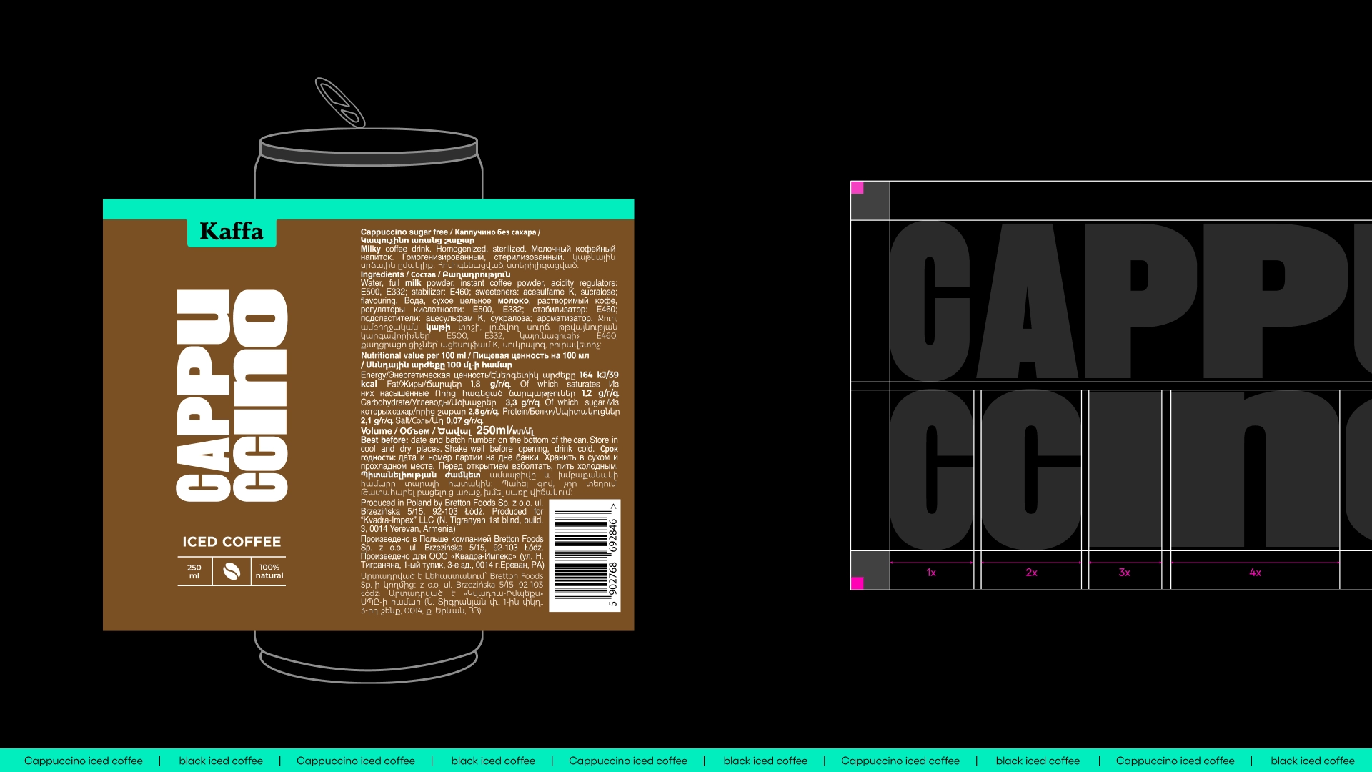
Clean typography and minimalism - this was the path we chose. As a result, through the bold vertical lettering of the product names and the combination of brown/black with turquoise, we achieved a memorable and fresh design that is at the same time refined.
Clean typography and minimalism - this was the path we chose. As a result, through the bold vertical lettering of the product names and the combination of brown/black with turquoise, we achieved a memorable and fresh design that is at the same time refined.
Team Involved
Karen Babajanyan / Founder & branding director
Tatevik Harutyunyan / Project Manager
Anya Andranikyan / Art Director
Shushan Gevorgyan / Graphic Designer
Related works
All works
Ararat Coffee
Ground Coffee