
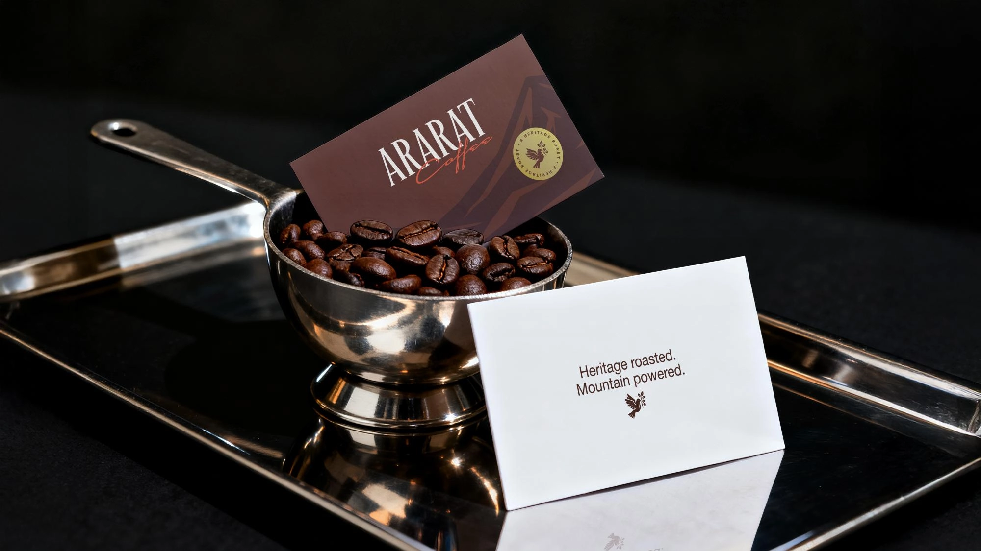
Ararat Coffee
About
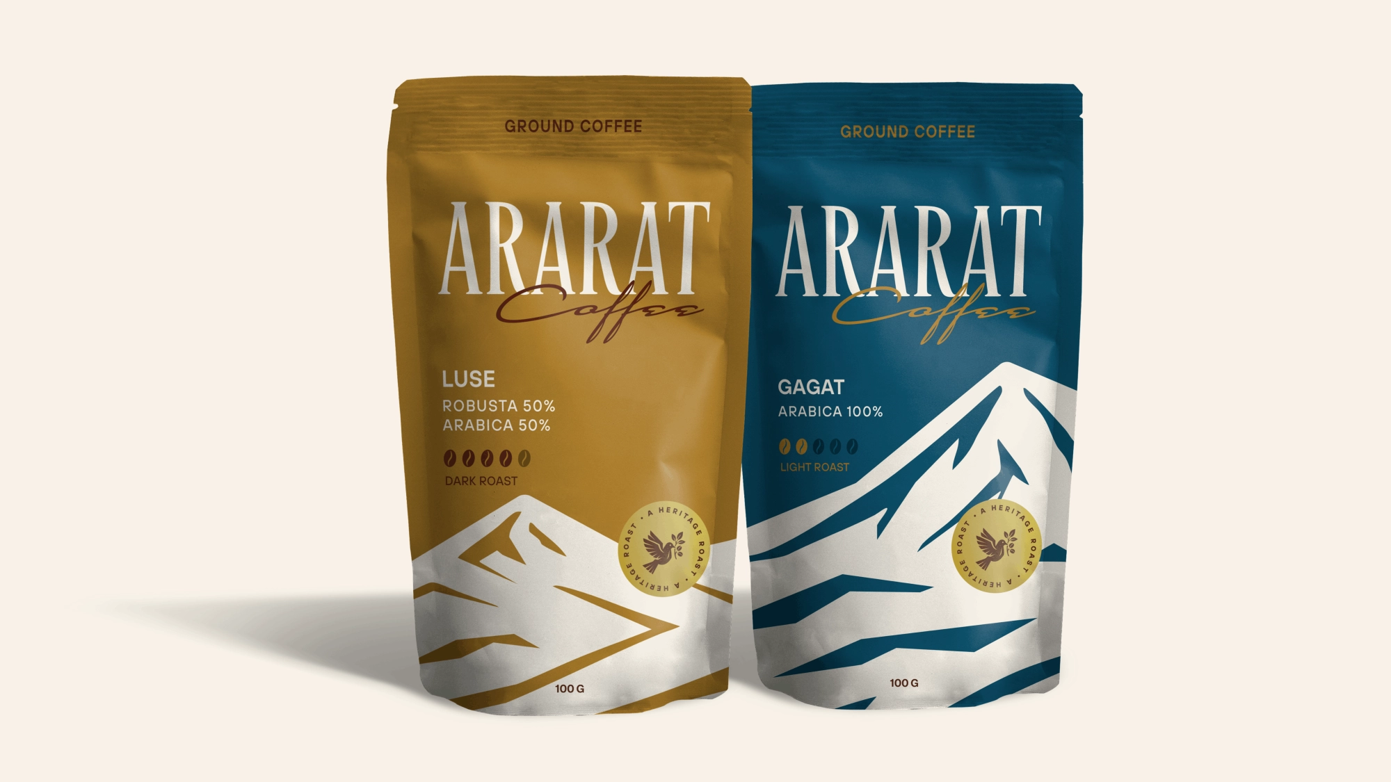
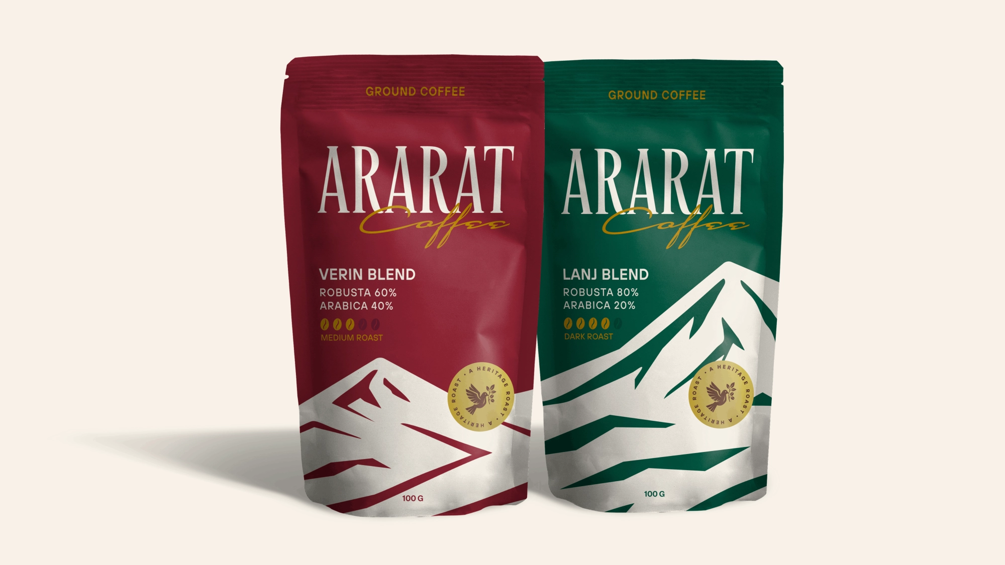
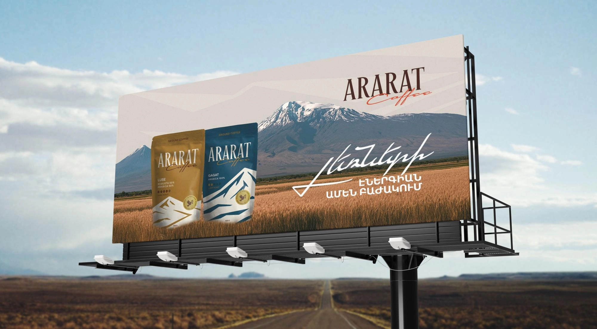
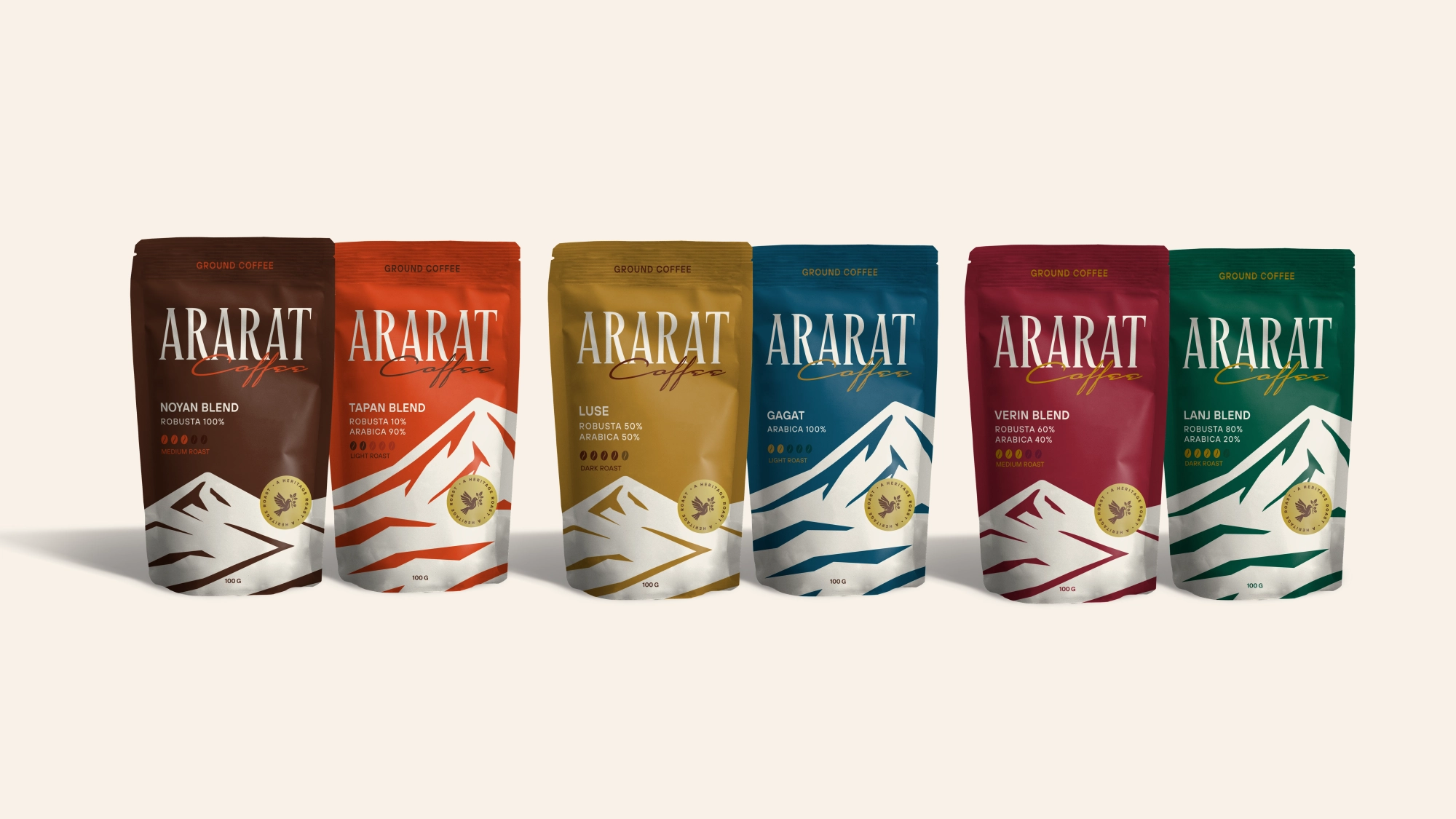
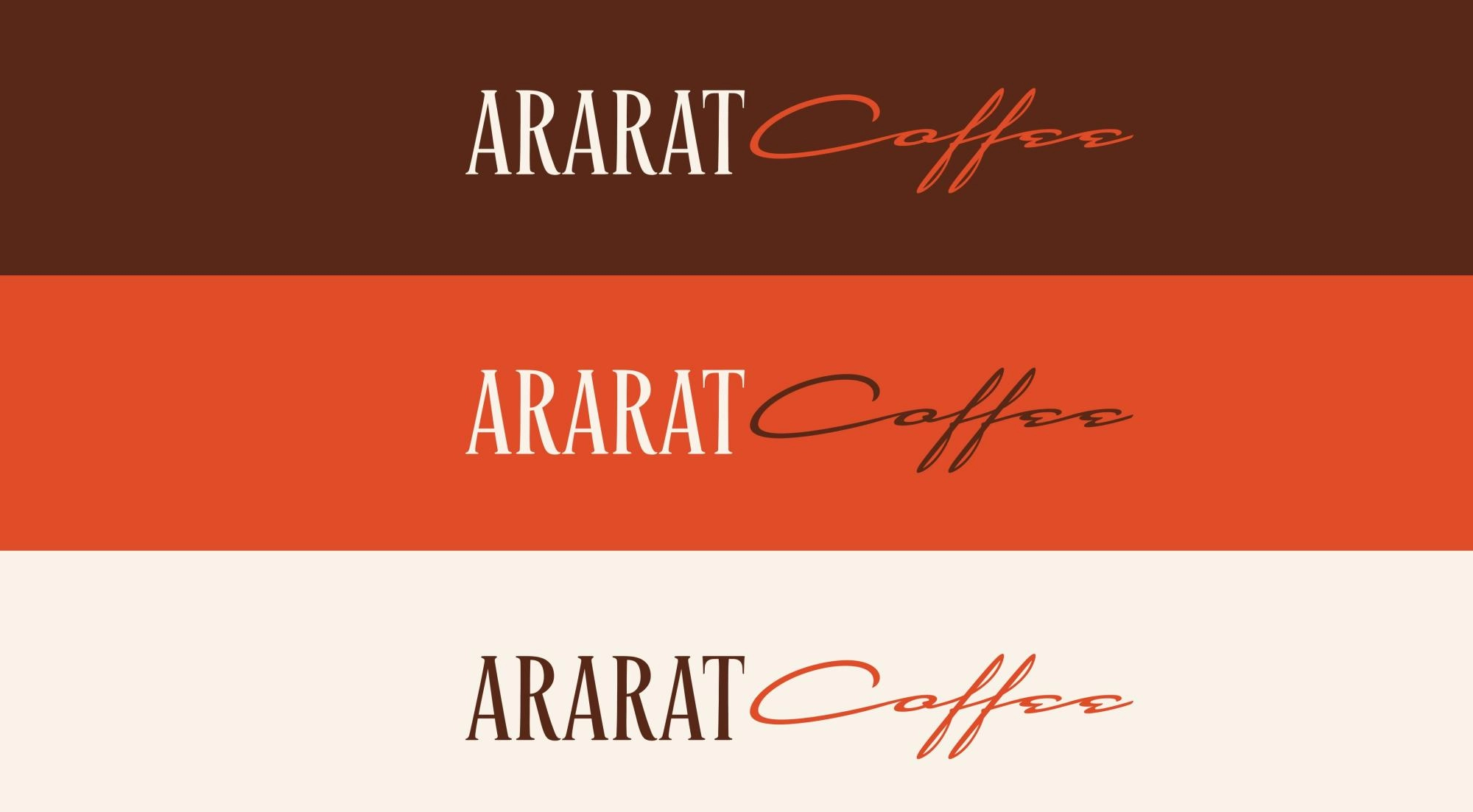
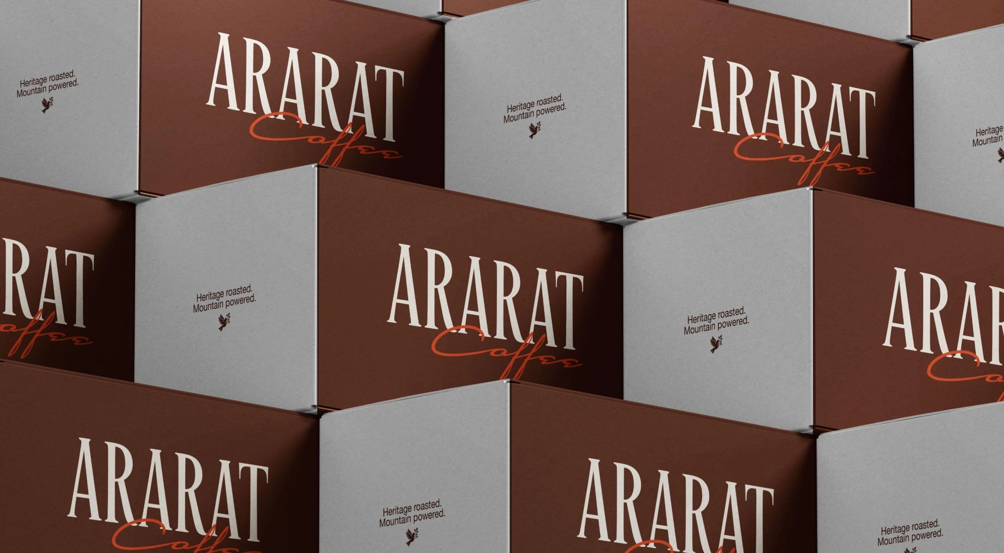
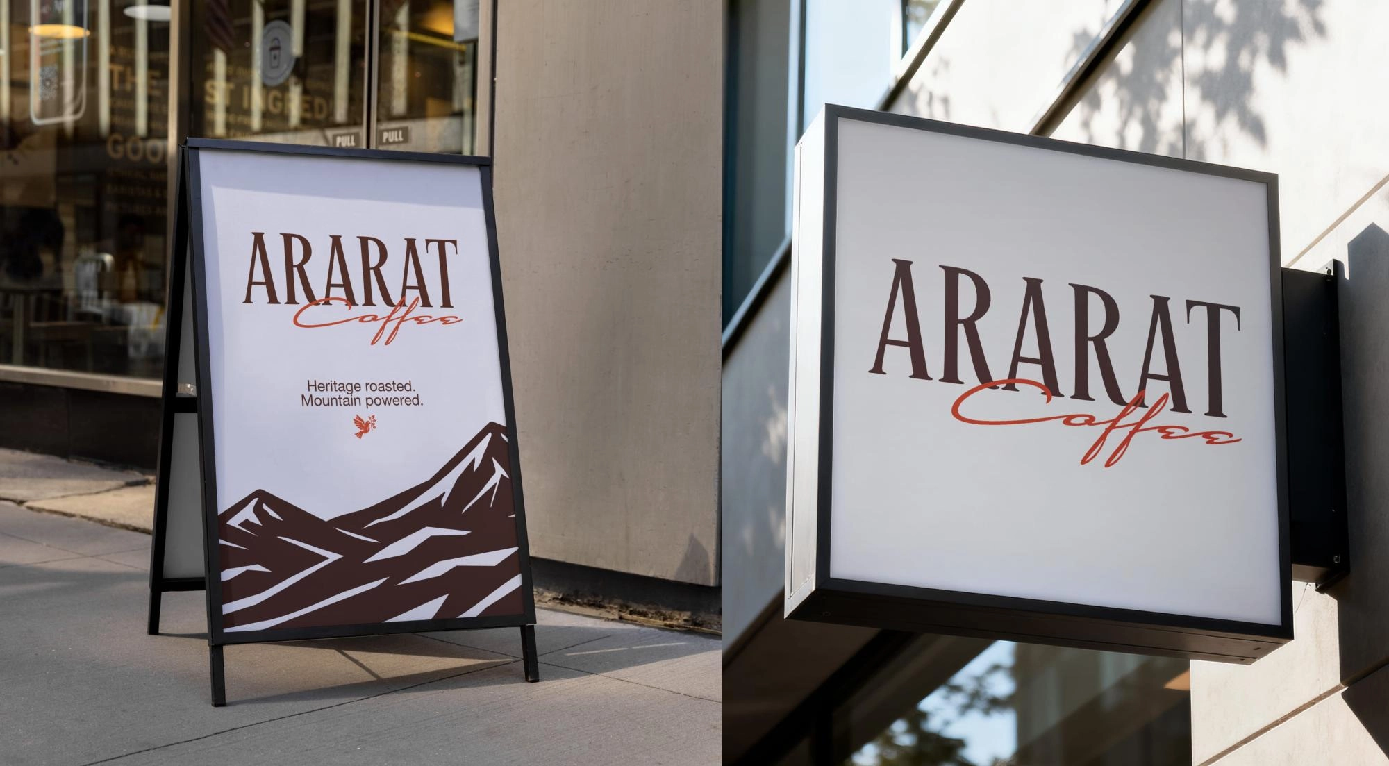
The Idea Behind the Design
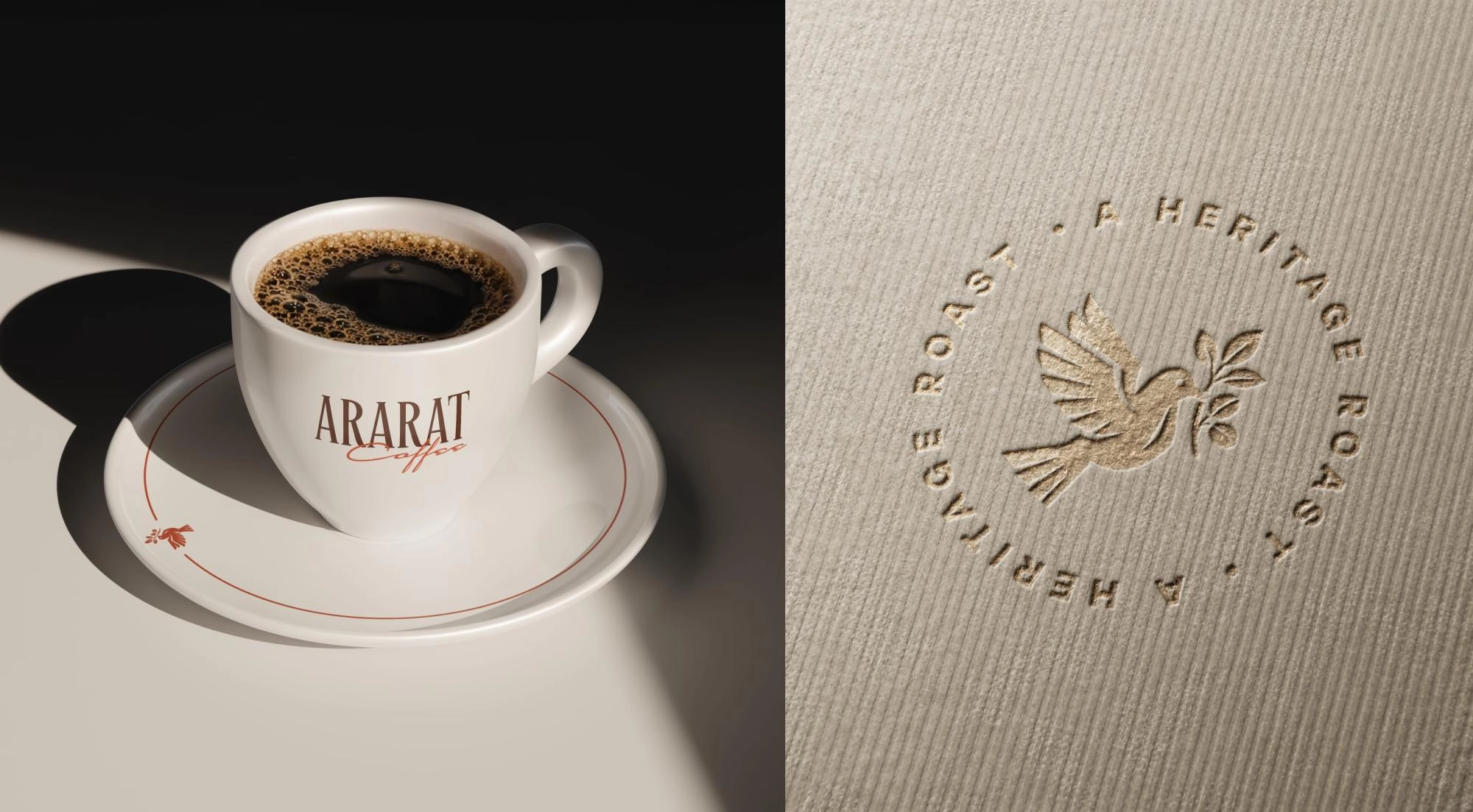
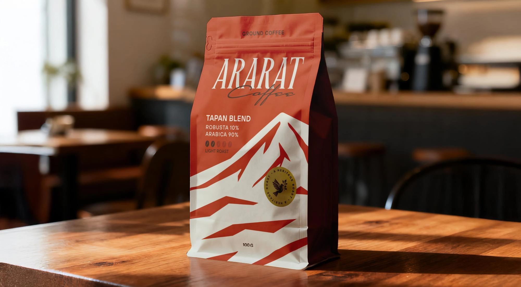
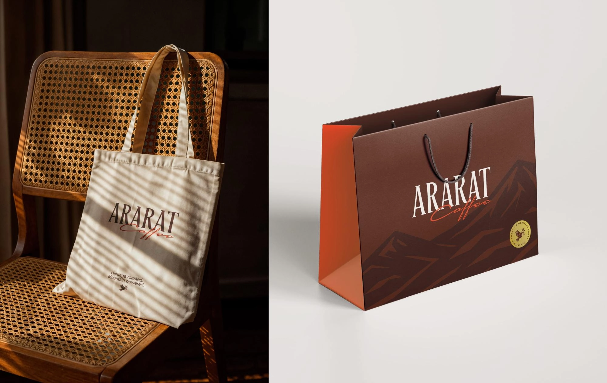
Created to stand out in a competitive market, the packaging concept presents coffee varieties in carefully designed pairs. Instead of directly depicting Mount Ararat, the biblical mountain is interpreted through a contemporary abstract visual language. Deep, vibrant colors highlight the unique character of each blend, while the dove holding a coffee branch subtly references biblical symbolism. Each variety carries its own name, designed to work both independently and as part of its pair, forming a cohesive and memorable identity.
Team Involved
Karen Babajanyan / Founder & Branding Director
Anya Andranikyan / Art Director
Ani Tadevosyan / Graphic designer
Tatevik Harutyunyan / Project Manager
.webp)